

Have you ever wondered how the world’s best companies consistently offer top-quality products? The secret lies in the company’s commitment to quality control and the foundation of quality control is Control charts.
Control charts in Quality control are a powerful tool that provides valuable insights into process performance by tracking data over time, enabling organizations to identify variations, prevent potential issues before they escalate, detect trends, and make data-driven decisions.
In this article, I will discuss the 9 most important Control Charts in Quality Control that every quality professional should be familiar with. I will discuss each control chart along with its applications and role in quality control.
So Are you ready to understand these 9 powerful control charts? Then Let’s get started…
What is a Control chart in Quality Control?
Suppose you are driving a car on the road. While driving your eyes are constantly on the speedometer to ensure that you are maintaining a constant speed of a car. After some time, you notice that the speedometer needle is continuously bouncing.
You think that there might be an internal problem, to see what’s going on inside you stop the car and open the bonnet. And you find that there is some problem with the engine because of which needle continuously going up and down and affecting car speed as well.
Similarly, Control charts in the world of quality control are like speedometers for business. They help you monitor processes to ensure they are running smoothly and consistently.
Just as a speedometer tells you if you are driving a car too fast or too slow, control charts give you valuable insights into process performance and help you identify when things are going problematic in the process.
You know in today’s customer-centric business environment, quality has become an important factor that can make or break a company’s success. It separates the market leaders from the crowd in the market.
- Quality control ensures that your products or services consistently meet or exceed customer expectations fostering loyalty, positive word of mouth and repeat business.
- By implementing quality control practices you can identify and address issues early on, minimizing waste, rework, and unnecessary expenses.
- QC acts like a skilled detective that investigates your processes for bottlenecks and inefficiencies. With this type of investigation, QC actually helps in continuous process improvement.
Quality control is not just about maintaining standards, it’s the backbone of business excellence, and you know the Control charts are considered the foundation of quality control.
During quality control initiatives in any type of industry control charts are used to track the process performance and detect any unusual variations or trends in the process.
In statistical language, Control charts in quality control are statistical tools that enable you to monitor process variation and detect any unusual or out-of-control behavior. (Check out – 5 core tools of quality)
They help you separate the common cause of variation from the special cause of variation. Common cause variation means random variation inherent in a process and Special cause variation is an unusual occurrence that impacts the process.
By distinguishing these two types with the help of control charts you can take appropriate actions to maintain process stability and improve quality. This powerful tool was introduced by Dr. Shewhart to monitor and control process variation and is also called Shewhart charts.
Control Chart Anatomy
You understood the fundamental concept of control charts and the importance of quality control practices for organizations. Now let’s get into more depth and understand the structure of control charts in quality control and their key elements.
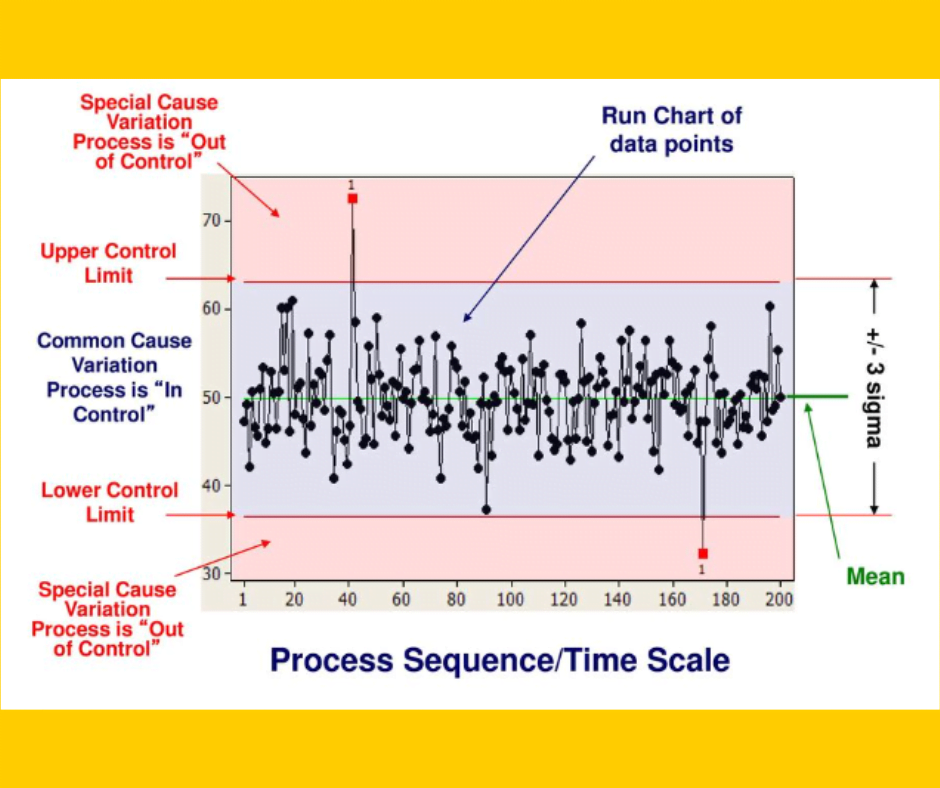
Now let’s see all the elements one by one:
- Data points: You can see the data points in the above chart (black in color) that represents the actual measurements or observations you collect over time. Eg: if you measure the diameter of the rod, each measurement of different rods is the data point.
- Centerline: You can see the centerline in the above chart (green in color) that represents the average or mean value of your data points. It gives you a baseline to compare against and helps you determine whether your process is performing as expected.
- Control limits: You can see two horizontal lines one is above the centerline and another is below the centerline. The line above the centerline is called the upper control limit (UCL) and below the centerline is called the lower control limit (LCL.
- Process is ‘in control’ region: You can see the UCL and LCL separated by +/- 3 sigmas and the region in between both the control limits is called Process is in the control region. Eg- If all the data points fall within the UCL and LCL then the process is in control.
- Process is ‘out of control’ region: The region above the UCL and below the LCL is called as out of control region. That means if any of the data points fall above UCL or below LCL then the process is considered out of control and needs to be investigated.
This is the basic structure and elements of control charts. By monitoring the data points on the control chart, you can assess the stability and predictability of your process and make data-driven decisions to keep it under control.
Here are some of the most important rules of control charts in quality control defined by Dr. Shewhart to identify the special cause variations in the process or to analyze control charts.
At the time reading below rules simultaneously see the above control chart anatomy image to get better clarity of rules. Let’s see them. (Check out – 7QC tools for process improvement)
- A large shift in the process: 1 data point is outside the control limits (can be outside UCL or LCL).
- A small sustained shift in the process: 8 to 9 data points on the same size of the center line (either above centerline or below centerline)
- A trend or drift up/down in the process: 6 consecutive data points are steadily increasing or decreasing.
- Non-random variation in the process: 14 consecutive data points are alternating up and down.
- A medium shift in the process: 2 out of 3 data consecutive data points are more than 2 sigmas from the center line in the same direction (either above or below the centerline).
- A small shift in the process: 4 out of 5 consecutive data points are more than 1 sigma from the centerline in the same direction (either above or below the centerline).
- Stratification: 15 consecutive data points are within the 1 sigma of the centerline.
- A mixture pattern: 8 consecutive data points on either side of the centerline with not within 1 sigma.
Benefits of Control Chart in Quality Control
- Control charts act as a radar system for quality control and allow you to spot issues or any problem in the process early on. Early detection helps you to take corrective action before defects or errors happen.
- Control charts help you determine whether the process is stable or unstable. By plotting data on the control charts, you can visually observe whether data points fall within the control limits or outside of control limits. (Within control limit – Stable, outside control limit – Unstable)
- Instead of relying on assumptions, control charts in quality control provide you with objective data to make informed decisions about the process.
- Control charts in quality control help you separate common causes and special causes of variation. This differentiation helps you target specific areas for improvement and allocate resources effectively.
- Control charts provide a visually appealing and intuitive way to analyze data. The visual representation of data points, control limits, and trends makes it easier for everyone involved to understand and interpret the information.
9 Types of Control Charts in Quality Control
Now you understood the basic structure as well as key elements of control charts and I also discussed the important benefits of Control charts in quality control.
Here I will discuss the basic concept of each chart and its application and control limit calculation I will discuss in the upcoming articles.
Control charts in quality control are divided into two categories on the basis of types of data. Let’s have a look at all 9 types of control charts one by one:
Continuous or variable data (measurements like weight, length)
- I-MR chart (Individual-Moving Range)
- X-bar R chart (Average-Range)
- X-bar S chart (Average-Standard deviation)
Attribute data (count like pass/fail, yes/no)
- NP chart (Number of defectives and sample size fixed)
- P chart (Proportion defectives and sample size varies)
- C chart (Number of defects and sample size fixed)
- U chart (Number of defects per unit and sample size varies)
1. I-MR chart:
I-MR chart is used when the data is continuous like measurements or observations. This chart tracks the process level and detects the presence of a special cause of variation when the sample size is one.
It is especially useful in situations where it’s not feasible to take multiple measurements at once. Instead, you take individual measurements. This chart is divided into two parts i.e. I chart and MR chart.
The I chart shows individual data points, where Individual measurement values are plotted with the center line being the average of the individual measurements. MR chart calculates the range between two consecutive data points.
By analyzing both these control charts in quality control together you can track both the process level and process variation at the same time which helps you detect the presence of special causes.
But, as this chart is dealing with individual measurements, it is not as sensitive as the X-bar chart in detecting process changes over time.
2. X-bar R chart:
X bar R chart is used when the data is continuous and the subgroup size is between 2 to 10. X bar chart helps you monitor the average or mean of the process data and how this mean data changes over time.
R chart means sample range (difference between the highest and lowest value in each sample) helps you measure the variability or spread of the process.
Both control charts in quality control provide you with valuable insights into the average and variability of the process. This chart is more sensitive as compared to the I-MR chart hence better at detecting process changes.
Say you are making delicious pizzas in a restaurant. You want to ensure that your pizzas are uniform in both taste and size. Here you can use the X-bar R chart to monitor this.
To create an X bar chart, you measure the average diameter of several pizza samples at different time intervals. You might measure the diameter of 10 pizzas every hour for a day.
By calculating the average of these measurements, you will get a sense of the average size of your pizzas over time. This can help you spot any deviation from the desired pizza size. Then R chart helps you understand the variation in pizza size.
You measure the range of diameter for each sample of pizzas. Range means the difference between the largest and smallest diameter of pizza within each sample.
By plotting these ranges on the R chart, you can see if the variations are within an acceptable range or not. This is one of the most commonly used control charts in quality control.
3. X-bar S chart:
X- bar S chart is used when the data is continuous and the sample or subgroup size is greater than 10. Here also X bar chart helps you monitor the average or mean of the process and how the mean changes with time.
S chart means standard deviation (SD – the measure of how far each data value is from the mean) chart measures the variability or dispersion of the process. Same to the X-bar R chart, this chart also provides valuable insights into the average and variability of the process.
You can refer to the same example that I discussed for the X bar R chart, the only difference is in this chart you create an S chart i.e. standard deviation chart instead of a range chart to monitor the variations in the process.
4. P chart:
Let’s say you run a factory that produces cookies and you want to make sure the cookies are of top-notch quality. Here P chart can help you monitor the proportion of nonconforming items or defectives in the process.
Suppose you have a big jar filled with cookies, and you decide to randomly sample some of them to check for defects. The P chart can help you track the proportion of defective cookies in each sample over time.
Let’s say you sample 50 cookies every day for a week. Each day, you count how many cookies have defects like cracks or burnt edges.
You record the proportion of defective cookies in your sample for each day. Here P chart then plots these proportions over time helping you see if there are any patterns or trends in the defects.
If the proportion of defectives is being measured and the sample size also varies then the p chart is the most suitable option. The structure of the P chart includes three things center line, Upper control limits, and lower control limits.
The Center line represents the average proportion of defective over time (this is obtained by dividing the number of defective units observed in the sample by the number of units sampled), while UCL and LCL show the upper and lower boundaries of acceptable variations.
The other things are the same as the standard control chart i.e. if data points within UCL and LCL means the process is in control while if shows any kind of pattern like data points beyond UCL and LCL means the process is out of control.
5. NP chart:
The NP chart is used to monitor and control the number of nonconforming items or defectives in the process. N in NP stands for the number of opportunities for a defect to occur and the P stands for the probability of a defect happening.
By tracking the number of non-conforming items, you can spot trends, identify potential issues and take action to improve processes.
If the defectives are being counted and the sample size is also constant then the np chart is useful. Let’s say you work at a chocolate factory, and your job is to ensure the quality of each chocolate bar.
With the help of an NP chart, you can keep track of how many defective bars are produced during a specific period like a day or a week.
You collect data on the number of opportunities for defects (let’s say you have 50 bars in a batch) and count how many of them are non-conforming.
For instance, if you find 10 defective bars in that batch, you would record it on the NP chart. With time, you keep filling in the NP chart with the number of nonconforming items for each batch you produce.
This helps you visualize the performance of your process and detect any patterns or changes that may be occurring. Hope you got a basic understanding of the use of the NP chart.
This chart also has the same elements i.e. centerline and control limits. UCL and LCL both limits show the boundaries of acceptable variations and the centerline represents the average number of nonconforming items.
6. U chart:
U chart helps you track and monitor the number of defects per unit of observation. It is specifically designed for situations where the number of defects can vary for different units of observation (sample size varies), like in manufacturing or service processes.
The purpose of this chart is to provide you with a visual representation of the stability and variation in the number of defects per unit over time.
By tracking this information you can identify patterns, potential issues, and make data-driven decisions about processes. Let’s say you work in a company that produces headphones.
Each headphone goes through a series of quality checks, and sometimes defects occur. Now you want to track how many defects occur per unit, where the unit is each headphone produced.
To create a U chart here, you would collect data over a period of time noting the number of defects for each unit. You could then plot this data on a graph with an X-axis time and Y-axis showing the number of defects per unit.
That’s how you get a view of defect rates. This chart also has the same elements as the above control charts in quality control i.e. centerline and control limits.
Centerline in U chart represents the average number of defects per unit and Both UCL as well as LCL show boundaries for acceptable variations.
7. C chart:
C chart stands for count, it helps you count and monitor the number of defects in a process or product. This chart helps you understand and control the variation in the number of defects that occur over time.
When defects are counted and the sample size is constant, the C chart can be used instead of the U chart. Let’s imagine that you operate in a chocolate factory and want to guarantee the greatest possible standard of chocolate bars being produced.
For that, you need to monitor the number of defects such as misshapen bars, broken pieces, or aid bubbles in each unit. To create a C chart, you collect data over a period of time. You might sample 60 chocolate bars every day and count the number of defects in each sample.
Here Chart will help you see if there are any patterns or trends in the number of defects and whether your process is stable or needs improvement. The structure of this chart is similar to the U chart like you have time on the X axis and the number of defects on the Y axis.
Each point on the chart represents the number of defects in the sample. Centerline represents the average number of defects and then UCL and LCL are nothing but boundaries of acceptable variations.
8. EWMA chart:
An exponentially weighted moving average chart shows the average value of a process and it is designed to detect small shifts or changes in the process. By monitoring these shifts, you can take action to prevent defects from occurring.
It provides you with early detection of process shifts, even when the shifts are small and might not be easily noticeable. Let’s say you have a lot of data such as sales numbers for your company over the previous few months.
A moving average computes the average of a predetermined number of data points at a time as opposed to examining each data point separately. This provides you with a clearer overall perspective of the situation.
That’s how it helps you detect small shifts in your data more quickly than other charts. In this chart, the central line represents the average value of a process (calculated by taking a weighted average of data points). and UCL as well as LCL are boundaries for acceptable variaitons.
9. CUSUM chart:
Cumulative sum control charts in quality control are specifically used in identifying small, gradual shifts that might go unnoticed using traditional control charts.
It helps you identify when a process has changed significantly from its desired or expected behavior. This chart calculates and plots cumulative sums of deviations from a target or reference value over time.
It allows you to monitor the cumulative deviations and detect when they exceed a certain threshold or predefined limit. This chart is more sensitive to small shifts in the process so sometimes it is used as an alternative to other charts.
How to select the right Control Charts?
When it comes to selecting the right control charts in quality control, there are certain things you need to consider.

Types of data:
See different control charts work best with different types of data. Is your data continuous like measuring the weight of the product, or the length of the rod? For continuous data, you have an I-MR chart, X-bar R chart, and X-bar S chart.
Or Is your data attribute like measuring the number of defects or a number of defectives? yes/ no, pass/fail type data. For attribute data, you have an np chart, p chart, U chart, and C chart. Understanding your data type will help you select the right control chart.
Sample size:
Consider how many data points you have in each sample. If you have a small sample size, you might need a control chart that is more sensitive to detect small changes like an X-bar R chart and an I-MR chart. For a larger sample size, you can use charts that are designed to detect bigger shifts like the X-bar S chart.
Variation:
Do you have a stable or unstable process? if your process is stable meaning it’s consistent over time, you can use a control chart that focuses on monitoring variation.
On the other hand, if your process is unstable, you can use a different control chart that aids in locating and addressing the main reasons why it is unstable.
Conclusion
Control charts provide a systematic approach to quality control and help organizations monitor and maintain process stability and efficiency. Organizations can build a foundation of statistical process control by integrating Control charts into their QC practices and also make informed decisions.
In today’s competitive market, if the organization wants to stand out from the crowd then the use of control charts for QC is not just an option, it is a complete necessity. By learning the 9 control charts you can help the organization achieve operational excellence & customer satisfaction.
In this article, I discussed all 9 control charts in quality control along with their application. Each chart is useful for different data types and scenarios. I hope you understood all these charts and now you are ready to use them at your workplace.
If you found this article useful then please share it in your network and subscribe to get more such articles every week.


