

Have you ever wondered why some organizations can navigate complex projects with ease while others struggle to find direction? The secret lies in mastering the application of 7 management and planning tools.
These 7 management and planning tools are integral parts of Lean Six Sigma, they are not only just theoretical tools but also practical instruments that drive decision-making, foster innovation, and enhance operational efficiency.
In this article, I will discuss the practical application of all 7 management and planning tools and how they can be leveraged to transform theoretical knowledge into actionable strategies to drive efficiency and innovation.
Whether you are a Lean Six Sigma practitioner, project manager, or business professional utilizing these tools will empower you to lead your organization towards sustainable success. Are you ready to master these powerful tools? Then let’s get started…
7 Management and Planning tools
Imagine steering a ship through the sea without a map. It’s chaotic, and directionless, in the end ship is going to hit some obstacles in the path. The same applies to businesses striving for excellence in their processes without effective management and planning tools.
These 7 management and planning tools are like a map guiding you during the process improvement journey and help you deal with complexities and challenges to reach your goals seamlessly. Now let’s see them one by one:
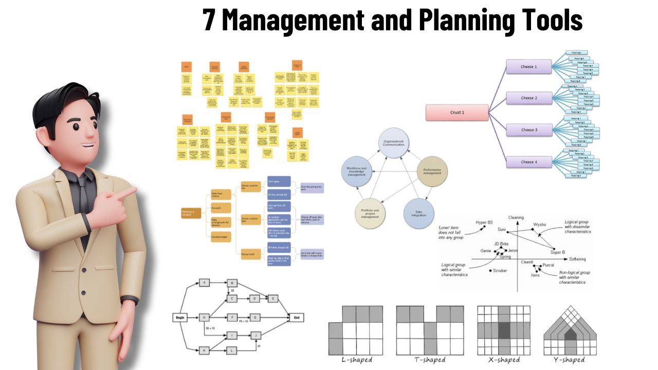
1. Affinity diagram:
One of the best management and planning tools is the affinity diagram also called the K-J method. This tool is used to organize a large number of ideas, data points, or issues into natural groupings based on their inherent relationships.
This technique helps the team synthesize vast amounts of information by finding common themes or patterns and facilitates clearer understanding and more effective problem-solving.
The primary purpose of an affinity diagram is to generate, organize, and consolidate information, making it easier to identify key insights and underlying issues.
It aids in breaking down complex data into manageable chunks, fostering collaboration, and encouraging creative thinking.
When to use this tool:
- When you need to generate and organize ideas, especially during brainstorming sessions.
- To identify root causes or categorize potential solutions during problem-solving.
- To sort and make sense of qualitative data during data analysis.
- When organizing tasks or steps in a project during the planning phase of a project.
- For feedback analysis to categorize customer feedback or survey responses.
Simple steps to create this diagram:
- You need sticky notes or index cards, markers, and a large work surface like a whiteboard or flipchart.
- Clearly state the issue or the topic at hand. This is the focus point for generating ideas.
- Ask participants to write down their ideas, issues, or data points related to the topic on individual sticky notes or cards. Encourage free thinking amongst the participants and collect a huge number of inputs.
- Place all the notes randomly on the work surface. This step visually represents the breadth of ideas generated.
- Without talking, ask participants to move the notes into clusters based on perceived relationships or similarities between ideas. This sorting of ideas encourages unbiased grouping based on intuition.
- Once the initial sorting is done, discuss each group to ensure everyone understands the rationale behind the clustering. Move notes if necessary and combine or split groups to refine the categories.
- For each group, write a header card that succinctly describes the theme or category. Place these headers at the top of each cluster.
- At the end review the grouped information and make any final adjustments. Ensure that all participants agree on the groupings and headers.
Tips for effective use:
- Involve team members from different departments to get a variety of perspectives.
- Have a neutral facilitator to guide the process and prevent dominant voices from steering the grouping.
- Ensure each group is distinct and its header clearly reflects the common theme.
- This minimizes bias and encourages intuitive connections between the ideas.
- As new information comes in, revisit and adjust the diagram to keep it relevant.
Practical example:
Let’s say you are working with a team to improve customer satisfaction in a retail store. You collect feedback from various sources such as surveys, online reviews, and in-person comments. Now using an affinity diagram you can organize these feedback points.
Feedback is – Long wait times, unfriendly staff, limited product variety, cleanliness issues, and inconsistent pricing.
Sorting – You might group this feedback into categories like ‘Service quality’, ‘Product issues’, and ‘Store environment’.
Headers on the boards are:
- Service quality – Long wait times, unfriendly staff
- Product issues – Limited product variety, inconsistent pricing
- Store environment – Cleanliness issues
2. Interrelationship diagram :
2nd one of the best Management and planning tools is the interrelationship diagram which is a visual tool used to map out the cause-and-effect relationships among various elements in a complex problem.
It helps the team understand the interdependencies and influences between factors, making it easier to identify root causes and prioritize actions. Its purpose is to simplify and structure the understanding of multifaceted issues.
By mapping relationships, it reveals key drivers of problems. Encourages collaborative problem-solving and consensus-building. At the end highlight the most impactful areas to address first.
When to use this tool:
- When facing intricate issues with many interrelated factors.
- To delve deeper into the underlying causes of problems.
- When there is a need to understand the dependencies and sequence of activities during project planning.
- To visualize and weigh the impact of different choices during decision-making.
Simple steps to create this diagram:
- Clearly state the problem or situation you are investigating. Write it at the top of your workspace.
- Brainstorm all the relevant factors or issues related to the problem. Write each one on a separate sticky note or card.
- Spread these factors out on a large surface so they are easy to see and move around.
- For each pair of factors ask: Does factor A influence factor B? If yes, draw an arrow from A to B. Repeat this for all pairs.
- Count the arrows pointing into each factor (incoming) and out of each factor (outgoing). Identify factors with many outgoing arrows (potential causes) and factors with many incoming arrows (potential effects).
- Focus on the key drives as they are likely to have the most significant impact on resolving the problem.
Tips for effective use:
- Involve team members from different departments to gain diverse perspectives.
- Encourage open dialogue because no idea is too small or insignificant.
- Different colors for arrows can help distinguish types of relationships (direct vs indirect)/
- Revisit and refine the diagram as more information becomes available or as the situation evolves.
- Avoid overcomplicating and focus on key factors that are actionable.
Practical example:
Let’s imagine a manufacturing company faces declining product quality. The team of engineers and supervisors wants to identify the interrelationship between different products.
They have identified the key elements such as machine maintenance, employee training, raw material quality, process control, and inspection procedures.
Write each of the factors or elements on a sticky note.
Draw arrows for interrelationship:
- Raw material quality → Product Quality
- Machine maintenance → Product Quality
- Employee training → Process control
- Process control → Product Quality
- Machine maintenance → Product Quality
- Inspection procedures → Product Quality
Many arrows point to ‘Product quality’ indicating it’s a major effect.
‘Raw material quality’ and ‘Machine maintenance’ have multiple outgoing arrows identifying them as potential root causes.
So improve raw material sourcing and machine maintenance schedules to improve the product quality. That’s how this management and planning tool helps you find the real root causes and interrelations between different factors.
3. Tree diagram :
3rd one of the most powerful and effective management and planning tools is the Tree diagram. It arranges the problem systematically in branches that’s why also called a systematic diagram.
Its primary purpose is to map out the various paths and strategies needed to achieve a goal or solve a problem. This visual representation helps identify the root causes of issues, organize ideas, and understand the relationship between different components.
When to use this tool:
- To identify the root causes of a problem by breaking it down into manageable parts.
- To explore all possible solutions and their implications during decision-making.
- During the project planning phase, this tool is useful to detail out tasks and sub-tasks necessary for project completion.
- During process improvement, this tool is useful to identify and analyze various factors affecting a process.
Simple steps to create this diagram:
- Start by clearly stating the main objective or the problem to be analyzed. Write this at the top or center of your diagram.
- Determine the major categories or factors that contribute to achieving a goal or solving the problem. These are your first-level branches.
- For each major category, break it down into finer levels of detail. Continue breaking down each subcategory until you reach the desired level of detail. These become your 2nd, 3rd, and 4th subsequent level branches.
- Arrange the branches logically. Ensure the diagram flows from the main goal to the detailed tasks or factors and shows a clear hierarchy.
- Check for completeness and accuracy. Ensure all branches contribute to the main goal and that nothing important is missed.
- Use the diagram as a guide for action. Regularly update and refine it based on feedback and progress.
Tips for effective use:
- Ensure the goal and each category on the diagram are clearly defined and easy to understand.
- Provide enough detail to be useful and stop at the level where further breakdown doesn’t add significant value.
- Utilize colors, shapes, and icons to differentiate between levels and categories, making the diagram visually appealing and easier to navigate.
- Involve team members in the creation process to ensure all perspectives are considered.
- Keep the diagram regularly up to date with reviews from the team and adjust as per new information and updates.
Practical example:
Let’s say you are working at a restaurant and you want to improve customer satisfaction. For this problem, you identified the major categories that affect customer satisfaction.
Major categories are Service quality, Food quality, Ambiance, Pricing, etc.
For the tree diagram break down these major categories into small branches as follows
Service quality – Staff training, Speed of service, Customer interaction
Food quality – Freshness of ingredients, Taste, Presentation
Ambiance – Cleanliness, Decor, Noise level
Pricing – Value for money, Special offers, Price consistency
Now create a tree diagram starting with ‘improve customer satisfaction’ at the top, branching out to the 4 main categories and further detailing each subcategory or branch.
Make sure that all relevant factors are included in the diagram for each major category and you can use this diagram to create specific action plans for each branch and track progress regularly.
4. Prioritization matrix:
A prioritization matrix is a decision-making tool used to rank items or projects based on a set of criteria. This is one of the best decision-making tools out of 7 management and planning tools.
Its main purpose is to help teams focus on the most critical tasks, ensuring that resources are allocated efficiently to achieve the best outcomes. This matrix helps in visualizing and prioritizing actions that will have the most significant impact on your goals.
When to use this tool:
- It is useful when you need to decide which projects or tasks to focus on during the project selection phase.
- It is useful when you need to allocate resources efficiently (time, money, manpower).
- It is useful when you need to make data-driven decisions during process improvement.
- It is useful when you need to drive continuous improvement by focusing on high-impact areas.
Simple steps to create this matrix:
- Clearly articulate the goal or problem you aim to address. For example, you might want to prioritize improvement projects in a manufacturing process.
- Determine the criteria that will be used to evaluate each option. Common criteria include cost, impact, feasibility, time required, and risk. Each criterion should be relevant to the objective.
- Generate a list of tasks, projects, or issues to be prioritized. Ensure this list is comprehensive and includes all potential options.
- Assign weight to each criterion based on its importance. The total of all weights should sum to 100%.
- Evaluate each option against the criteria. Assign a score to each option for each criterion, typically on a scale of 1 to 10, where 10 represents the highest value or best performance.
- Multiply the score of each option by the weight of the criterion. Sum these weighted scores to get a total score for each option.
- Rank the options based on their total weighted scores. The option with the highest score is the top priority.
- Discuss the results with team members to ensure that the prioritization makes sense and aligns with strategic goals.
- Implement the top priority tasks first. Continuously monitor the progress and revisit the matrix if there are significant changes in the circumstances.
Tips for effective use:
- Involve key stakeholders in this process to ensure alignment with organizational goals.
- Use data and factual information to score options rather than subjective opinions.
- Avoid overcomplicating the matrix. Use clear and relevant criteria to make the process manageable.
- Regularly revisit and update the matrix as new information becomes available or circumstances change.
Practical example:
Let’s say a software development company needs to prioritize features for its next product release. They want to maximize customer satisfaction and market competitiveness by adding new features.
They considered the 4 important criteria for this feature addition and each criterion was given weightage such as Customer demand (40%), Development cost (20%), Time to market (20%), and Strategic alignment (20%).
There are 4 features the company wants to add i.e. A, B, C, D. Then you need to assign a score for each feature considering the criterion. Then calculate weighted scores for each feature.
Then rank each feature based on their total weighted score. The feature with the highest rank should be the top priority. As per that, you can prioritize features and add them during product development.
See, don’t worry if you do not understand this calculation part because I will discuss this tool in detail in a separate article. For now, only focus on the application of this one of the best management and planning tools.
5. Matrix diagram:
5th one of the most important management and planning tools is a matrix diagram also called a correlation matrix or relationship matrix. It’s a visual representation tool used to analyze the strength of the relationship between different sets of factors.
Its primary purpose is to organize and prioritize information enabling effective decision-making based on data-driven insights. And organize data in a structured format allowing you to identify patterns, gaps, or areas for improvement.
When to use this tool:
- This tool is useful in identifying critical factors influencing a process and their interrelationships during process improvement.
- It is useful in understanding the relationship between different product features and customer preferences during product development.
- It is useful for risk management, assessing the impact of various risks on different aspects of a project or business.
Simple steps to create this diagram:
- First, identify the key factors or variables you want to analyze. These could be process steps, product features, risks, etc.
- Determine the criteria for evaluating the relationship between factors. This could be based on frequency, intensity, or impact.
- Create a grid with the identified factors listed along both the horizontal and vertical axes. The cells of the matrix will represent the relationship between each pair of factors.
- Populate the cells of the matrix based on the defined criteria. Use symbols, colors, or numeric values to indicate the strength of the relationship between each pair of factors.
- Once the matrix is complete, analyze the patterns and trends to gain insights into the relationship between the factors.
Tips for effective use:
- Focus on the most critical factors and avoid overcomplicating the matrix with too many factors or variables.
- Ensure consistency in how you assess the relationship between factors to maintain accuracy and reliability.
- Update the matrix regularly to reflect changes in the environment or factors influencing the system.
- Involve stakeholders from different areas of expertise to gather diverse perspectives and insights.
Practical example:
Let’s say a manufacturing company aiming to improve its production process. They identify several factors influencing production efficiency such as machine downtime, operator skills, raw material quality, and maintenance frequency.
By using a matrix diagram, they assess the relationship between these factors and prioritize areas for improvement. It provides better clarity and direction for improvement.
For instance, they may discover that machine downtime has a strong correlation with maintenance frequency, highlighting the need for proactive maintenance strategies.
6. Process decision program chart (PDPC):
PDPC is a detailed, visual tool used for anticipating potential problems and their solutions within a project. Because of its effective decision-making, it is considered one of the best project management and planning tools.
It breaks down the main activities into smaller tasks and identifies potential issues that could arise at each step, along with preventive measures and contingency plans.
The purpose of a PDPC is to ensure that potential obstacles are identified and mitigated early in the project planning stage, thereby improving the likelihood of success.
When to use this tool:
- Use PDPC when you are in the initial stages of planning a project to foresee potential issues.
- Ideal for complex projects with many steps and variables where potential problems are not immediately obvious.
- Beneficial when implementing a new process where unknown variables may exist.
- In projects where failure is not an option, every potential issue must be anticipated.
Simple steps to create this chart:
- Clearly state the main objective or activity at the top of the chart.
- Identify the major tasks required to achieve the goal.
- For each major task, brainstorm potential problems that could arise.
- Analyze and list the root causes of each identified problem.
- For each root cause, identify measures that can prevent the problem from occurring.
- Develop contingency plans for problems that cannot be entirely prevented.
- Draw the chart starting with the main goal at the top, branching out to major tasks, then potential problems, root causes, preventive measures, and contingency plans.
- Use symbols and lines to visually connect these elements. Make sure you review PDPC regularly and update if needed.
Tips for effective use:
- Involve team members from different departments to gain diverse insights on potential problems.
- Don’t rush the process. Ensure all potential problems and root causes are identified.
- Revisit and update the PDPC regularly as the project progresses and new information becomes available.
- Use clear symbols and lines to make the chart easily understandable.
- Ensure preventive measures and contingency plans are documented and communicated to all relevant stakeholders.
- Test the PDPC with hypothetical scenarios to ensure it is robust and comprehensive.
Practical example:
Let’s say your company is planning to launch a new product. For that, you need to use PDPC considering the goal – Launch a new product.
Major tasks in the process are Market research, Product development, Marketing strategy, and Production.
Now let’s define the potential problem, root cause, preventive measure, and contingency plan for each task. That’s how you can use PDPC.
Market research –
- Potential problem: insufficient data
- Root cause: Limited access to databases
- Preventive measure: Subscribe to multiple market research databases
- Contingency plan: Use third-party market research firms.
Product development –
- Potential problem: Design flaws
- Root cause: Inadequate prototype testing
- Preventive measure: Conduct thorough prototype testing
- Contingency plan: Implement a quick redesign process
Marketing strategy-
- Potential problem: Ineffective campaign
- Root cause: Poor targeting
- Preventive measure: Perform detailed audience analysis
- Contingency plan: Adjust strategy based on initial feedback
Production –
- Potential problem: Production delays
- Root cause: Supply chain issues
- Preventive measure: Establish strong supplier relationships
- Contingency plan: Maintain backup suppliers
7. Activity network diagram:
Last and one of the most important management and planning tools is the activity network diagram also known as a project network diagram. It is a simple graphical representation of a project’s activities and the sequential relationship between them.
The primary purpose of an AND is to visualize the order in which tasks must be performed, identify dependencies, and help project managers plan, schedule, and monitor project progress effectively.
When to use this tool:
- To outline the entire project and understand task dependencies during project planning.
- To determine the optimal sequence of activities and estimate project duration.
- To identify critical paths and allocate resources effectively.
- To foresee potential delays and their impact on the project timeline.
- For project performance monitoring, track progress and make adjustments as necessary.
Simple steps to create this diagram:
- Clearly understand the project goals and deliverables.
- Break down the project into smaller tasks or activities. Ensure each task is well defined.
- Identify which activities depend on the completion of others. Use tools like a dependency matrix if needed.
- Arrange the activities in the order they need to be performed. This step is crucial for determining the project flow.
- Start with the initial activity. Represent each activity as a node (usually a box or a circle).
- Connect the nodes with arrows to show the sequence and dependencies.
- Use forward and backward arrows to denote the start and end of tasks.
- Assign a time estimate to each activity. This could be in days, weeks, or any other time unit relevant to your project.
- Identify the critical path. The critical path is the longest sequence of activities that determine the shortest possible project duration.
- Highlight this path to focus on activities that directly impact the project timeline. Check the diagram for accuracy and completeness.
- Ensure all activities and dependencies are correctly represented. Validate AND with the project team and stakeholders and update it throughout the project lifecycle.
Tips for effective use:
- Ensure the diagram is not overly complicated. Focus on key tasks and dependencies.
- Involve team members in creating and updating the AND to get accurate inputs.
- Use project management software tools like MS Project, and Lucidchart to create and update your AND.
- Review and update the diagram regularly to reflect project progress and any changes.
- Clearly identify and monitor the critical path as delays in these tasks will impact the entire project timeline.
- Share the Activity network diagram with stakeholders to keep everyone informed about the project status and potential bottlenecks.
Practical example:
Let’s say the project is – Organizing a corporate training event. The scope is to organize a full-day training event for 100 employees.
Activities in this project are: Identify venue, Book venue, Arrange catering, Send invitations, Confirm attendees, Prepare training materials, Arrange transportation, etc.
Determine activities dependencies:
- Book venue -> Identify venue
- Confirm attendees -> Send invitations
- Arrange catering -> Confirm attendees
Sequence activities:
- Identify venue -> Book venue
- Send invitation -> Confirm attendees -> Arrange catering
- Prepare training material (independent of other activities)
- Arrange transportation (independent of other activities)
Draw a diagram create nodes for each activity and connect them based on dependencies.
Estimate durations:
- Identify venue – 2 days
- Book venue – 1 day
- Send invitations – 3 days
- Confirm attendees – 5 days
- Prepare training material – 7 days
- Arrange transportation – 2 days
- Arrange catering – 2 days
After this identify the critical path in the project lifecycle and review resource allocation accordingly. Look for ways to optimize and shorten the duration where possible.
See don’t worry about the critical path calculation for that also I need to discuss the activity network diagram in detail in a separate article. In an upcoming article, I will discuss this, one of the most important project management and planning tools in detail.
These are the 7 most powerful management and planning tools used during all types of projects such as product development, and process improvement. Mastering these tools always helps you manage your project work effectively and improve your decision-making as well.
If you want to learn all the 7 management and planning tools for problem-solving and get certified in Lean Six Sigma then I would like to recommend the best practical live training program check out – Lean Six Sigma with Minitab live training program and certification.
Conclusion
Mastering these 7 management and planning tools is not just about adding techniques to your toolbox, you know it is more about transforming how you approach problem-solving and strategic planning.
As a Lean Six Sigma practitioner or project manager, by integrating these 7 management and planning tools into your toolkit you help your team to go through the project complexities effectively.
These 7 management and planning tools are not just theoretical concepts, they are more of a practical instrument for every project leader that can be applied to real-world scenarios to drive significant improvements.
If you found this article useful then please share it in your network and subscribe to get more such articles every week.


