
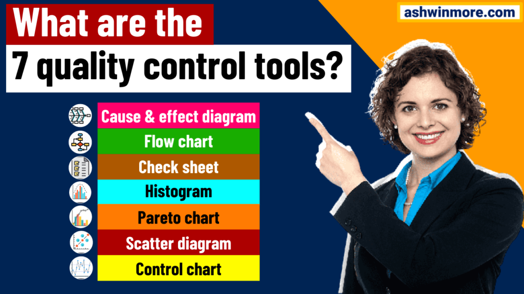
7 qc tools are popularly used for problem-solving at organizations. The father of total quality management Dr.Ishikawa has been associated with the development and advocacy of using 7 quality control (QC) tools in the organization.
Karu Ishikawa is considered one of the great quality gurus of all time, he believed that 90% of problems in processes could be solved using these powerful 7 quality control tools.
These 7 quality control tools can be used for improving the performance of production processes from the first step of producing the products to the last stage of production. In this article, we are going to understand these powerful 7qc tools for process improvement along with their applications. So let’s start…
What is the 7qc tools?
Those who are working in the process improvement domain need the ability to quickly identify and solve quality or process-related issues efficiently and effectively for them these 7 qc tools are the best things.
Because these 7 tools can help you manage the quality of your product/services as well as help you improve processes, no matter which industry you are from. You can apply these tools in any type of industrial process.
These quality control tools are the means for collecting data, analyzing data, identifying root causes, and measuring the results. It works on the basis of numerical data. These tools were developed by Dr. Ishikawa and initially implemented in Japan’s industrial training programs.
Because of their powerful results, these tools are still considered as a gold standard for a variety of quality/process-related issues. Now let’s talk about these 7 qc tools one by one with examples –
Read more – What is Six Sigma methodology?
Read more – What is Lean manufacturing?
1. Cause & effect diagram –
Cause & effect diagram is one of the most powerful quality tools (from the list of 7 qc tools) developed by Professor Karo Ishikawa which is also called as Ishikawa diagram, its structure looks like fish bones that’s why it is also called a fishbone diagram.
This tool is a composition of lines and words representing a meaningful relationship between an effect, or condition, and its causes. It is used to identify potential causes of problems and then the root causes to be identified after validation.
In the fishbone diagram, we generally right effect on the right side and potential causes of problems on the left side. The potential causes are divided into 6 categories depending upon the type of process whether it is a transactional process or a product-based process.
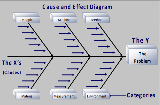
The potential causes of problems that are found in any product-based process (output of the process is a physical product) are divided into 6 categories like Measurement, Manpower, Method, Machines, Material, Mother nature, etc.
On the other hand, The potential causes of problems that are found in any transactional process (output of the process is service) are divided into 6 categories like People, Policy, Procedure, Place, Measurement, Mother nature, etc.
To find out these potential causes of the problem Six Sigma project team performs a brainstorming session in which all team members come together and discuss the causes of problems, after conducting this session the team member divides all listed causes of the problem into those 6 categories of causes depending upon the type of process.
Benefits of cause & effect diagram –
- Helps identify cause-and-effect relationships with underlying problems.
- Breaks problems down into bite-size pieces to find the root cause.
- Help facilitate joint brainstorming discussions.
- Brainstorming sessions encourage broad thinking and foster teamwork.
- Improve process knowledge.
- Focuses on causes of problems instead of symptoms.
Example of cause & effect diagram –
This example of the cause and effect diagram is of chemical purity. (Problem or Y variable) and all potential causes are divided into 6M categories as this is a product-based process.
That’s how the Problems are written on the right-hand side and their respective potential causes are written on the left-hand side.
2. Flow chart –
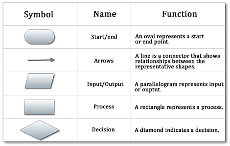
A flow chart is a diagram that uses graphical symbols to depict the nature and flow of the steps in a process. Overall we can call it a graphical representation of the process, which includes the sequential flow of processes and subprocesses.
All the process steps are shown with symbolic shapes like rectangles, diamonds, parallelograms, eclipse, etc., and process flow is indicated by the arrows.
This is the 2nd number tool from the list of 7 qc tools that is used in all types of industries to understand processes visually. This tool helps the Six Sigma improvement project team –
- Identifying bottlenecks and unnecessary steps in the process and removing them to streamline the process.
- To determine how the process currently functions.
- To determine how the process could ideally function.
- Understanding the potential weakness in the process visually.
- To identify which activities in the process are completed when and by whom.
- To identify how processes flow from one department to another.
Benefits of flow chart –
- Understand the process and Identify process improvements.
- Clarify the working relationships between people and processes.
- Determine major and minor inputs in the process.
- Identify time lags in the process and non-value-added steps.
- Promotes overall process understanding.
Example of process flow chart –
This is an example of a pizza delivery process flow chart. Every symbol in the flowchart represents a specific function in the pizza delivery process. Using this flow chart one can identify issues in the process and opportunities for improvements.

3. Check sheet –
The check sheet is a graphical presentation of information, a data gathering, and an interpretation tool which is also considered the simplest way to assess common process problems. It is used for collecting data in real-time and at the real location, where data is generated.
It helps the process improvement team in distinguishing between actual facts and opinions, and also to gather data about how often a problem occurs in the process and the type of that problem.
This sheet is generally a blank form that is designed for the easy and effective recording of the required process information, it could be in the form of continuous or discrete data. That data can also be used as input data for making other 7 qc tools.
Generally, data is recorded by making simple marks or checks in the different regions of check sheets, which are then read by observing the problem location and number of marks on the sheet.
These check marks on the check sheet indicate how many times a particular value has occurred, which then helps you figure out the defects or errors within your process or products, sometimes even causes of defects. (There are 4 types of check sheets we will discuss those in a separate article.)

Benefits of Check sheet –
- Collect data in a systematic and organized manner.
- To determine the source of the problem.
- To facilitate the classification of data.
- Helps to provide input data to make a bar graph, Pareto chart, and histogram.
- Helps to make one-stop decisions to control non-compliance related to production and process.
Example of Check sheet –
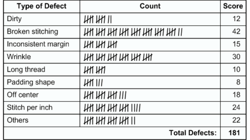
In this example, the data collected is about defects in the products. In the 1st column, 8 types of commonly overserved defects are added, and in the 2nd column frequency of those defects counted by using ‘check marks’ means how many times a particular defect has occurred in the product.
You will see those counted observations in the form of continuous data in the last column. That data can be further used for plotting the bar graph, histogram, and Pareto chart to understand graphically which type of defect occurs the most.
By observing the check sheet also we can say that ‘broken stitching’ has mostly occurred defect types. Then we can think about improvement action on this. This is a sample example of a check sheet.
4. Histogram –
A Histogram is a vertical bar chart tool that depicts the distribution of data after data collection. It is a one-time snapshot of process performance because it reflects the voice of the process and visualizes what is going on in the process.
It determines the frequency of occurrence of data and compares the process results with specification limits. It is used in six sigma projects to understand the distribution of data and communicate information to the team and also assist them in decision-making.
The most popular use of histograms is to check the normality of data, it helps in understanding whether the process data is normally distributed or non-normally distributed.
By understanding this, the team will take further action. It is useful in analyzing whether the process meets the customer’s requirements or not.
Is there any process change that has occurred during a certain time period? Is the output of two or more processes different? etc. So overall this tool makes data easier to conclude and initiate action.
Benefits of Histogram –
- To know whether process data is normally distributed.
- To know whether the process is produced within specifications.
- To know whether the process is stable or predictable.
- Process monitoring and centering.
- Helps in visually understanding which data value occurs most and least frequently.
Example of Histogram –
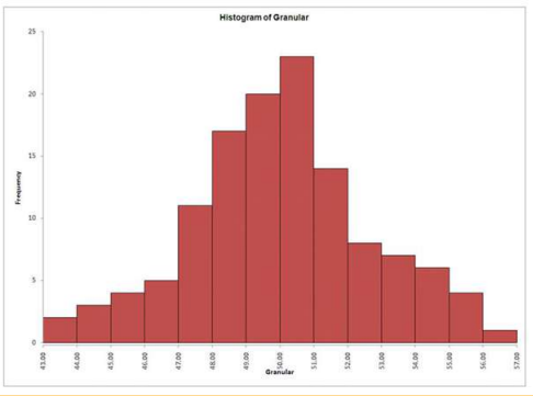
In this example of the histogram, you can see that on the right side, we have collected data (Output of checksheet). For the same data, we plotted the histogram on the left side.
The values for the measurements are shown on the horizontal axis (Gap in mm) and the frequency of each value that occurs is shown on the vertical axis as a bar graph.
Example – In the measurement process, data value 16 occurs 12 times, data value 11.5 occurs only 1 time, etc. 19 is the most frequently occurred data value and 13, 23.5 is the least frequently occurred data value.
That’s how this graphical tool illustrates the distribution of the data by showing which values occur most and least frequently.
The visual analysis of the graph will qualify for further investigation of the quantitative relationship between the variables. The shape, centering, and spread of the data you have.

5. Pareto chart –
A Pareto chart is a bar graph used to arrange information in such a way that priorities for process improvement can be established.
It consists of both bar and line graphs, in which individual data values are represented in descending order by bars, and the cumulative total is represented by a line.
This tool is used to rank business problems starting from the most frequent to the least frequent with the final goal of focusing efforts on the factors or variables that have the greatest overall impact.
It works on the basis of Pareto principles or 80/20 principles which say 20% of causes lead to 80% of problems. The most important use of this tool is to separate vital few factors from trivial many factors means it helps improvement project teams to identify and focus on vital few factors.
In a nutshell, it is used as a prioritization tool that prioritizes the factor that is the most frequent reason for the problem. Eg – Suppose “The problem is – Customer complaints and the project team collected 8 factors (in the form of data) that cause customer complaints.
To find out which factor is most responsible for customer complaints, they plotted a Pareto chart. In the outcome chart shows the team that bad customer support is the most responsible reason for customer complaints out of those 8 factors.
That’s how the Pareto chart helps the project team to highlight the most important factor among the 8 factors that cause customer complaints.
This means by improving customer support, the project team can reduce customer complaints.” This tool shows ordered frequency counts of data. Through that, it helps in identifying areas to focus on first in process improvement.
I hope you got the conceptual idea of the Pareto chart with this example. The most important thing you should remember is, this prioritization tool separates vital few from trivial many.

Benefits of Pareto chart –
- Displays the relative importance of problems in a simple visual format.
- Helps a team focus on the causes that have the greatest impact.
- It helps in the prioritization of the problem as per its overall impact.
- Allows you to determine which problems may need to be addressed first.
Example of Pareto chart –
This example of the Pareto chart shows 6 factors data that cause engine overheating. You can see on the Y-axis all those 6 factors are mentioned and for each factor, data values are collected and plotted on the chart in descending order. The X-axis shows the frequency of occurrence of each factor.
From this chart, one can easily say that damaged radiator cores and faulty fans are the major responsible causes of engine overheating so the project team needs to focus on these factors to solve the overheating problem.
That’s how the Pareto chart (one of the 7 qc tools) helps to find out vital few factors from trivial many factors. In this example, vital few factors are damaged radiator core and faulty fans which have more impact on engine overheating.
So the team will first address the radiator core issue and then check faulty fans in order to reduce overheating.

6. Scatter diagram –
A Scatter plot or scatter diagram is a powerful tool to identify correlations or cause-and-effect relationships between two variables.
It uses dots to represent values for two different types of numeric variables or data. The position of those dots on the X and Y-axis indicates values for an individual data point.
On X-axis independent variables are positioned and dependent variables are positioned on Y-axis, each data point on the diagram represents one common intersection point. And when those intersection points are joined then those dots highlight the relationships between two variables.
This tool is not only useful for showing relationships between variables but also useful in understanding the type of relationships when all data values are collectively considered. It could be positive-negative, strong-weak, moderate negative-moderate positive, type of relationship, etc.
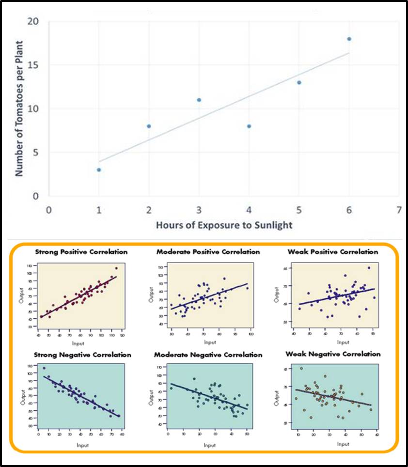
So this is one of the best tools out of 7 qc tools to graphically represent relationships between two variables (positive or negative). Which helps in identifying potential root causes of the problem and in understanding whether cause & effect are related.
This tool is the foundation for correlation and regression analysis study, this study converts the graphical understanding of scatter plots into a mathematical form in order to understand the strength of the relationship as well as to get the mathematical model of relationships.
Benefits of Scatter diagram –
- It shows the relationship between two variables visually.
- It shows a pattern of data values and also highlights outliers easily.
- Helps in identifying the most significant factors affecting the process.
- Useful to verify that any changes in the input variables will influence the output variable.
Example of Scatter diagram –
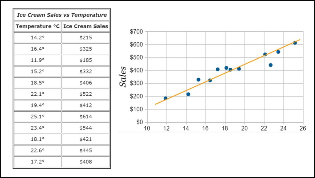
In this example, the ice cream shop compared two factors for 12 days i.e. ice cream sales vs temperature. They want to check whether the temperature has any effect on ice cream sales.
On the left side, they collected data for 12 days, and on the right side, they plotted a scatter plot to understand that relation graphically.
Ice cream sales data values (dependent variable) are added on Y-axis and temperature data values (independent variables) are added on X-axis.
In conclusion, the Scatter plot clearly shows the positive relationship between temperature and ice cream sales means the temperature has a positive effect on sales.
Finally, they conclude that the higher the outside temperature higher the ice cream sales or we can say both these factors are directly proportional to each other.
That’s how the scatter diagram (one of the 7 qc tools) gives us a clear picture of the relationship between two variables.
7. Control chart –
Control chart is a process monitoring and improvement tool that helps professionals determine whether or not the process is stable and predictable, making it easy to identify factors that cause variation in the process. It shows whether the process is performed within the control limits or not.
Control charts are used to determine the Baseline performance of a process, evaluate measurement systems, compare multiple processes, and compare processes before and after a change, this one of the tools from 7 qc tools shows you how a process changes over time, etc.
There are a total of 6 types of control charts like I-MR chart, X-bar R chart, X-bar S chart, P and Np chart, C and U chart, etc. All these charts are used depending on the type of data we have.
We will discuss those types in detail in the next article, for this article our focus is on understanding the basic structure of the control chart. Right!
Every control chart has three basic elements i.e. Average line, Upper control limits, and Lower control limits. These three elements are finalized on the basis of historical data.
The data collected from the current process (using a check sheet) is plotted on the control chart and then the collected data values are compared with historical data (control limits). In order to determine whether the current process is in control or gets affected due to variations.
If all the data values are falling in between the upper and control limits then the process is considered as in control, but if any of the data values are falling beyond the control limits then the process is considered out of control.
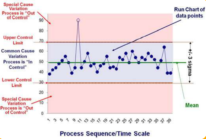
It is the indicator that the process has some special cause of variation because of which it is not in control and the project team needs to investigate this and work on bringing it back in control. So the control chart will give you a clear visual picture of how your process performing.
Simply, it provides you with two basic functions; one is to provide time-based information on the performance of the process which makes it possible to track events affecting the process and the second is to alert you when Special Cause variation occurs.
Benefits of Control chart –
- To distinguish between common causes and special causes of variation in the process.
- Provides cues for taking action to bring back the process in control.
- Visually shows whether the process is in control or not.
- Helps identify which data values are outliers or falling beyond control limits.
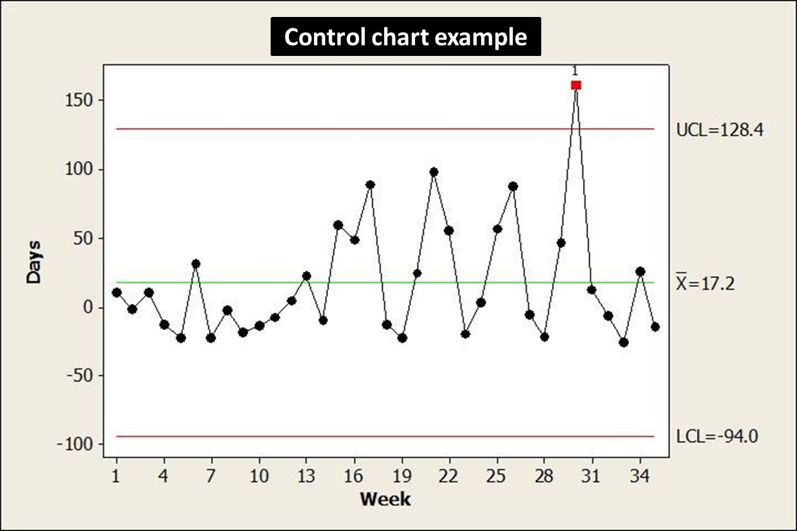
Example of Control chart –
In this example of the control chart, you can see the Upper control limit = 128.4 and the Lower control limit = -94.0, and the mean = 17.2. This is an X-bar R chart, in which all the data values are plotted almost all data values fall in between upper and lower control limits. Only one data value is falling beyond the upper control limit.
From that, we can say that the process is not in control (it has one outlier or special cause of variation), which means there is a need to investigate the process and also recheck that data value which is the main cause of the out-of-control situation.
So, that’s how from the control chart we can understand how the process performs over time and get some ideas to further take action for the process improvement. (Check out – 7qc tools templates)
Read more – Templates of 7 quality control tools
If you want to learn problem-solving tools and get certified in Lean Six Sigma then I would like to recommend the best practical live training program check out – Lean Six Sigma with Minitab live training program and certification.
Conclusion –
The 7 qc tools are considered powerful tools for problem-solving as well as for process improvement purposes. These tools help the project team in understanding visually how the process is performing and what causes problems in the process.
It highlights problem areas of the process by analyzing actual process data. These 7 qc tools provide direction to the project team on where to focus and which areas to investigate for improvement.
These tools help the improvement project team to solve 90% of the process problems and improve processes by analyzing data and making the right improvement decisions.
In this article, we covered all these 7 qc tools in detail. I hope you got clarity on the application of each tool and how useful it is during problem-solving.
If you found this useful then please share it in your network and subscribe to get more such articles on Lean Six Sigma.


Pingback: What is Check sheet used during DMAIC project?
Pingback: What is Bottleneck analysis? Understand with example
very helpful indeed
Pingback: Control Charts in Quality Control: 9 Charts You Must Know
Very Helpful & easy to understand.
Thanks for your feedback!
Thank you for your feedback!