
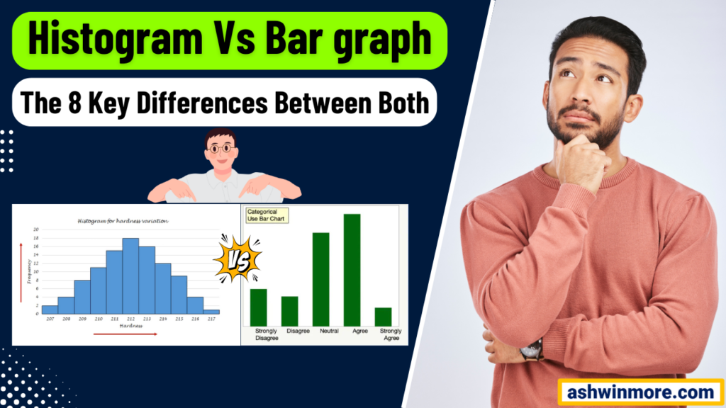
Have you ever been confused with the histogram vs bar graph? Unable to decide which one is the right tool to use when visualizing your data. Then you are at the right place.
Whether you are analyzing defect rates on the production line, or monitoring cycle times in a service process, having a clear understanding of your data is essential for driving informed decisions and achieving meaningful results.
Histogram and bar graph allow you to visualize the distribution of your data and gain valuable insights into its patterns, trends, and outliers. While they may appear similar initially, both serve different purposes and are best suited for different types of data analysis.
In this article, I will discuss the fundamental difference between the histogram vs bar graph, from their visual appearance to their underlying principles of data representation. Whether you are a Lean Six Sigma practitioner or data analyst understanding this distinction is crucial.
This will help you select the right tool for your analysis and effectively communicate your findings to stakeholders. Are you ready to understand the key differences between the histogram vs bar graph? Then Let’s get started…
Importance of Data Visualization In Lean Six Sigma
Before understanding the Histogram vs the Bar graph, first understand the importance of Data visualization. You know it plays a crucial role in Lean Six Sigma methodology which focuses on data-driven problem solving and process improvement.
In Lean Six Sigma, you deal with large datasets containing valuable information about processes and performance. However raw data can often be overwhelming and difficult to interpret.
Data visualization helps convert this information into meaningful insights by presenting it in a visually digestible format. By visualizing data, you can quickly identify patterns, trends, and relationships that may not be apparent from just looking at numbers.
This is important in Lean Six Sigma for detecting areas of improvement or root causes of problems within processes. Effective decision-making relies on having a clear understanding of the situation at hand.
Data visualization provides decision-makers with a comprehensive view of performance metrics, allowing them to make informed decisions quickly. Lean Six Sigma projects often involve cross-functional teams with varying levels of expertise.
Data visualization serves as a universal language that transcends technical barriers, enabling seamless communication among team members.
See, people are naturally drawn to visuals, making data visualization an effective tool for engaging stakeholders and getting support from them for improvement initiatives.
When stakeholders can see the impact of a problem or the benefits of a proposed solution through compelling visuals, they are more likely to support and actively participate in Lean Six Sigma projects.
Two commonly used data visualization tools in Lean Six Sigma are histograms and bar graphs. Both serve to represent data visually but understanding their differences (Histogram vs Bar graph) is crucial for utilizing them effectively in improving processes.
Let’s see them one by one first and then after that, I will compare (Histogram vs Bar graph) both tools on different parameters so that you can clearly understand the major differences between them.
What is Histogram?
A histogram is a graphical representation that shows the distribution of data over a continuous interval or certain categories. I can call it a snapshot of your data’s story.
The purpose of a histogram is to give you a clear picture of how your data is spread out, whether it is concentrated in one area, spread out evenly, or skewed in some way.
It helps you understand the frequency or count of different values within a data set and allows you to identify patterns, trends, variability, shape of data, and anomalies.
Components of histogram:
- Bars: These bars represent the frequency or count of data points within each range or bin.
- X-axis: This axis shows the range of values or categories being measured.
- Y-axis: It displays the frequency or count of occurrences for each range or category.
- Bins or intervals: These are the segments or buckets into which your data is grouped. Each bin captures a specific range of values.
- Central tendency indicator: Often you will see a line or marker representing the central tendency of the data like the mean or median.
Examples of when to use histogram:
- Suppose you are overseeing a manufacturing process, and you want to assess the distribution of product dimensions to ensure they meet specifications. A histogram can help you visualize any deviations from the desired dimensions.
- If you are analyzing survey responses on a scale from 1 to 5, a histogram can reveal the distribution of ratings. This can help identify areas where customers are particularly satisfied or dissatisfied.
- Suppose you are managing inventory levels for a retail store. A histogram can show the distribution of sales over different periods, helping you forecast future demand and optimize stock levels.
- In finance, the histogram can be used to analyze the distribution of stock returns, identify outliers, and assess risk.
Some practical tips for creating and interpreting histograms:
- The width of your bins can significantly impact the interpretation of the histogram. Too narrow bins and you might miss important trends, too wide bins and you might oversimplify the data. So choose the proper bin width.
- Pay attention to the shape of the histogram. A symmetrical distribution suggests balance while skewness indicates a shift towards one end. Outliers represented by bars far from the main cluster can provide valuable insights into anomalies in your data.
- The size of your dataset influences the granularity of your histogram. Larger samples tend to provide a more accurate representation of the underlying distribution. So make sure you consider the proper sample size.
- If you are comparing datasets or analyzing changes over time, consider creating multiple histograms and displaying them side by side for easy comparison.
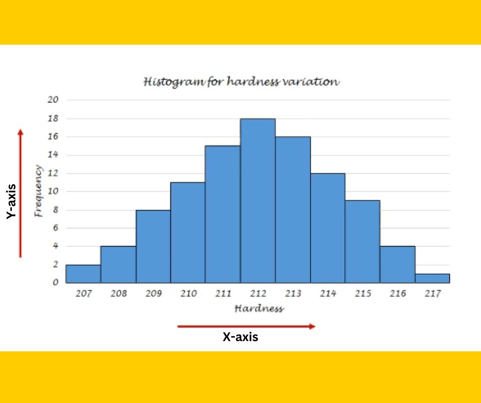
Example of Histogram:
The below histogram is created for the hardness variation values of a particular product. Here you can see Y-axis displays the frequency of occurrence of each category of hardness variation value.
For example, the hardness variation value 207 occurred 2 times, 208 occurred 4 times, 209 occurred 8 times, and so on. On the other hand, the X-axis displays Individual hardness variation values such as 207, 208, 209, 210, and so on.
From this histogram, you can say that the frequency of occurrence of hardness variation value 212 is highest as compared to others i.e. 18 times. This data is symmetrically distributed. I Hope now you understand the histogram before comparing the histogram vs the bar graph.
What is the bar graph?
The bar graph is a visual representation of categorical data using rectangular bars of varying lengths. Each bar typically represents a category or group and the length of the bar corresponds to the frequency, quantity, or value associated with that category.
The purpose of a bar graph is to compare different categories or groups of data and to easily visualize patterns or trends within the data. Let’s understand the bar graph in more detail before seeing the comparison of the histogram vs the bar graph.
Components of a bar graph:
- Bars: Rectangular bars representing the different categories or groups of data being compared.
- X-axis: Horizontal axis showing the categories or groups.
- Y-axis: Vertical axis representing the frequency, quantity, or value associated with each category.
- Labels: Clear labels for both axes and the bars themselves.
- Bar length or height: The length or height of each bar corresponds to the value of the category it represents.
- Colors or patterns: Different colors or patterns may be used to distinguish between bars representing different categories or groups.
Examples of when to use a bar graph:
- Bar graphs are ideal for comparing discrete categories or groups of data. For example, comparing the sales performance of different products or the performance of different teams within an organization.
- They can be used to visualize trends over time such as monthly sales figures or quarterly performance metrics.
- Bar graphs are also used to display survey responses or demographic data, making it easy to compare responses across different groups.
- Bar graphs can also be used to visualize key performance indicators (KPIs) and track progress toward improvement goals.
Some practical tips for creating and interpreting a bar graph:
- There are different types of bar graphs such as vertical bar graphs (column charts) and horizontal bar graphs (bar charts). Choose the type that best suits your data and the message you want to convey.
- Avoid cluttering the bar graph with unnecessary details. Focus on presenting the most important information clearly and concisely.
- Ensure that the scales on the axes are consistent and appropriate for the data being presented.
- Use labels, colors, or annotations to highlight key points or trends in the data.
- Interpret the bar graph in the context of the problem or process being analyzed, and consider any external factors that may influence the data.
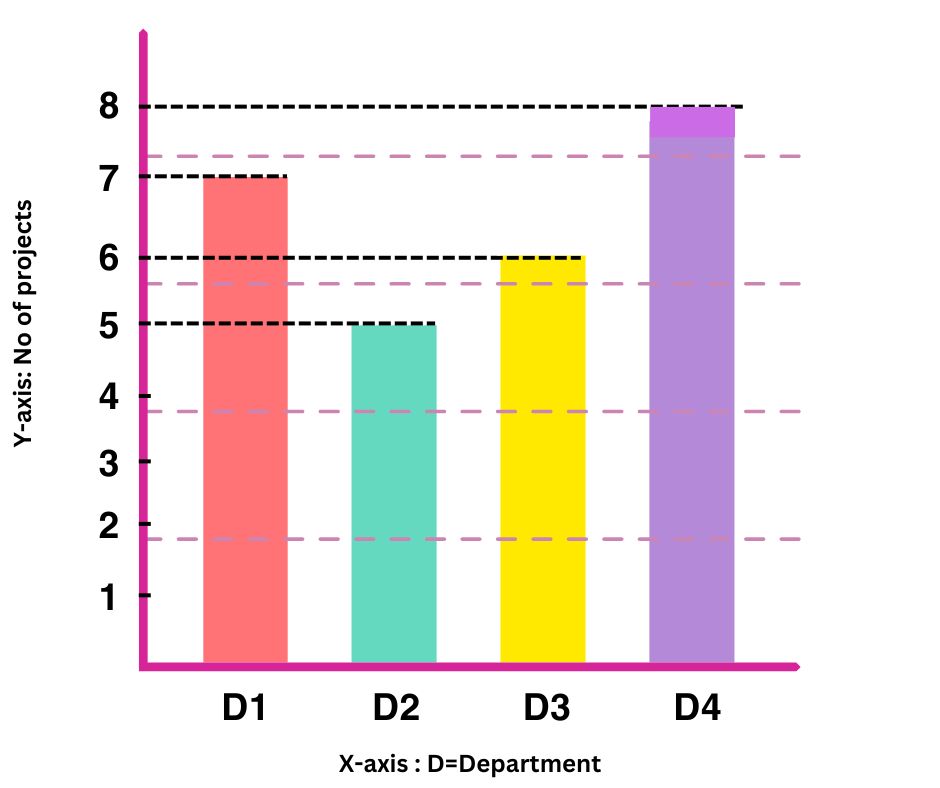
Example of a bar graph:
Here you can see the bar graph comparing the data of a number of projects done by different departments of the company. Each department D1, D2, D3, and D4 is represented by a separate color bar, and the height of each bar represents a number of projects completed.
By analyzing this bar graph you can say that Department 4 (D4) has done the highest number of projects i.e. 8, On the other hand, Department 2 (D2) has done the lowest number of projects i.e. 5.
With this analysis company’s top management can focus on departments where a number of projects is low and provide them with support and resources so that they can conduct new projects for the company’s growth.
Comparison: The Histogram Vs Bar Graph
Now let’s compare the histogram vs the bar graph on 8 important parameters such as purpose, data representation, axis information, data types, interpretation, gap between bars, general use, and usage in Lean Six Sigma.
By comparing the histogram vs the bar graph, you can easily use them depending upon their applications and the type of data you want to analyze, See below the key differences between these 2 powerful data visualization tools.
| Parameter | Histogram | Bar graph |
| Purpose | Its purpose is to visualize the distribution of data and help understand the spread, shape, and central tendency of data. | Its purpose is to represent discrete categories or groups of data and to compare the quantities or frequencies of these categories. |
| Data representation | It represents continuous data using bars that touch each other, indicating that the data is continuous and can take any value within the range. | It represents discrete categories or groups of data using separate distinct bars. |
| Axis information | The x-axis represents the range of values of intervals of continuous data and the y-axis represents the frequency of data points within each interval. | The x-axis represents the categories or groups of data and the y-axis represents the frequency or quantity associated with each category. |
| Data types | It is used for continuous data such as measurement, time, or weight. | It is used for discrete data such as categories, types, or groups. |
| Interpretation | Its interpretation involves analyzing the distribution shape, central tendency, and variability of the data. | Its interpretation involves comparing the heights of bars to understand the relative frequencies or values of different categories. |
| Gaps between bars | There are no gaps between the bars as they represent continuous data, and each bar covers a specific range or interval. | There is often a small gap between bars to visually distinguish between different categories or groups. |
| General use in analysis | Useful for identifying patterns in continuous data, such as identifying outliers, assessing normality, or understanding distribution characteristics. | Useful for comparing discrete categories or groups such as comparing performance across different departments or product sales. |
| Usage in Lean Six Sigma | Histograms are used in the measure phase of DMAIC to analyze the distribution of process data and identify potential areas for improvement. | Bar graphs are used to present categorical data or to compare performance metrics between different groups or categories, especially in the Analyze and Improve phase. |
I hope with these 8 major parameter differences between the histogram vs bar graph, now you can easily decide when to use which tool for your data analysis during improvement projects.
If you want to learn data analysis tools for problem-solving and get certified in Lean Six Sigma then I would like to recommend the best practical live training program check out – Lean Six Sigma with Minitab live training program and certification.
Conclusion
Understanding the key differences between the histogram vs the bar graph is essential for effective data analysis and decision-making in process improvement projects.
Both graphical representations (Histogram vs bar graph) serve to visually display data, they have distinct purposes and applications that can significantly impact the interpretation of information.
By leveraging the strength of both graphical representations, You can enhance their data analysis capabilities, make more informed decisions, and ultimately, achieve greater success in process improvement initiatives.
If you found this article on the Histogram vs Bar graph useful then please share it in your network and subscribe to get more such articles every week.

Pingback: Box Plot: How To Utilize It For Data Analysis?