
Are you tired of drowning in a sea of data and struggling to understand its hidden stories and valuable insights? Then you must use the powerful data analysis tool Box-plot to convert your data into valuable information.
Imagine you are in charge of optimizing a manufacturing process and you are bombarded with mountains of data on cycle time, defect rates, and machine performance. How do you even begin to make sense of all that data? That is where you need Box-plot.
It provides a visual representation of distribution, central tendency, variability of the dataset, and potential outliers. It summarizes the key statistical measures such as the median, quartiles, and outliers, and shows the data’s overall behavior.
In this article, I will discuss box-plot in detail along with its components, its advantages & limitations, and practical applications in the real world. Most importantly I will discuss step by step guide for creating and interpreting this powerful data analysis tool.
So, are you ready to master one of the best data analysis tools and transform your raw data into insightful information? Then let’s get started…
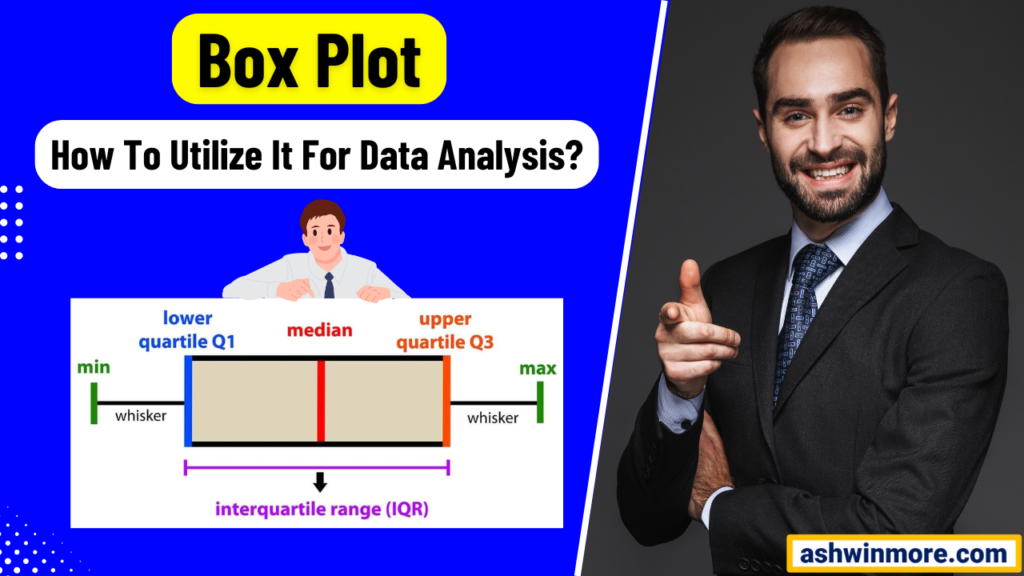
What is a Box plot?
A Box plot also known as a box and whisker plot, is one of the most popular graphical tools used during process improvement projects to summarize and visualize the distribution of a dataset.
They provide a concise summary of the central tendency, dispersion, and skewness of the data and make it easier to identify patterns, variations, and potential outliers.
The primary purpose of a box plot is to offer a visual representation of the key statistical measures of a data set and allow you to quickly assess the variability and distribution of the data.
This helps in understanding the process performance, identifying potential sources of variation, and making data-driven decisions for process improvement. Let’s see the important components below.
Components of box plot:
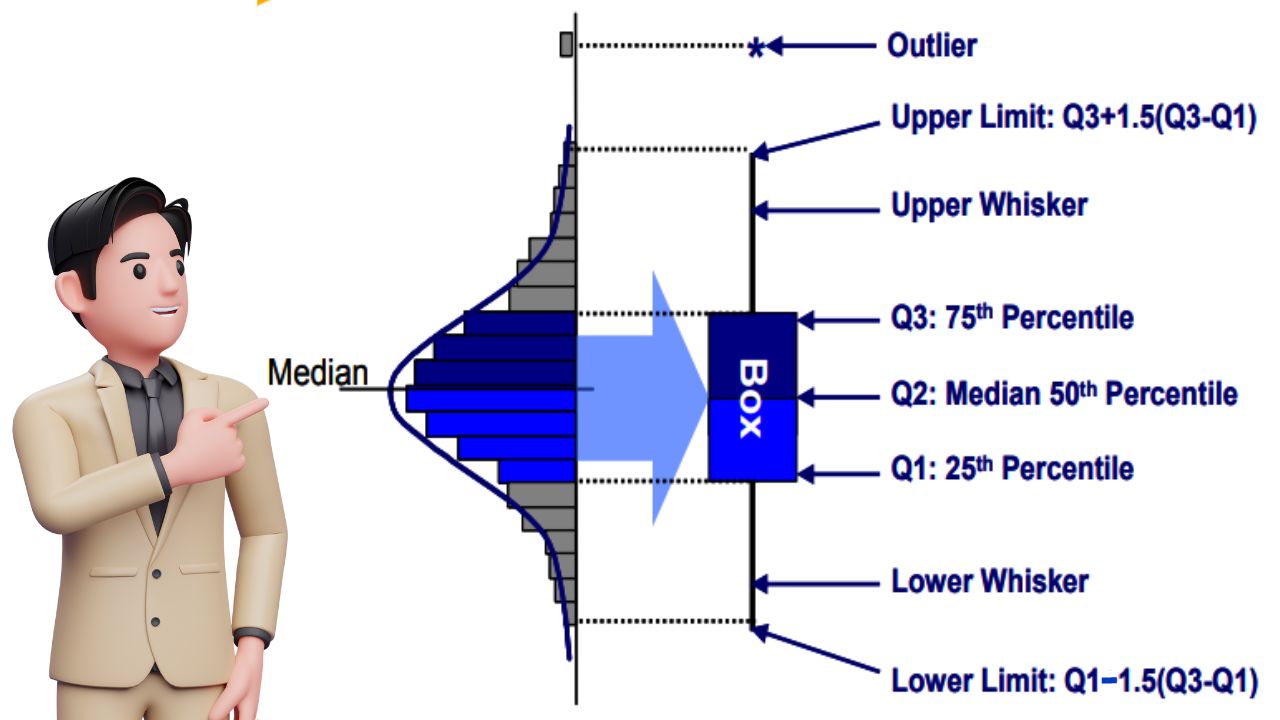
- Median (Q2): It is represented by the line inside the box, it is the middle value of the dataset when arranged in ascending order. It divides the data into two halves, with 50% of the observation or data values falling below and 50% above it.
- Quartile (Q1, Q3): Quartiles are the values that divide the dataset into 4 equal parts. Q1= the lower quartile represents the 25th percentile and indicates that 25% of data falls below this value. While Q3= the upper quartile represents the 75th percentile and indicates that 75% of the data falls below this value.
- Interquartile range (IQR): IQR is the range of values between the first and third quartiles (Q1 & Q3). It measures the spread or dispersion of the middle 50% of the data and is calculated as IQR= Q3 – Q1.
- Whiskers: The whiskers extend from the box to indicate the range of the data outside the quartiles. They typically represent either 1.5 times the IQR above Q3 and below Q1.
- Outliers: Outliers are the individual data points that fall significantly outside the range of the whiskers. It represents the observations that are unusually high or low compared to the rest of the data and may indicate special causes of variation in the process.
From the above image, you can see that the box plot consists of a rectangular box with the line ( the median) dividing it into two halves. The box represents the IQR, while whiskers extend from the box to depict the range of the data.
Outliers if present are displayed as individual data points beyond the whiskers. Interpreting this graphical tool involves analyzing the position of the median, and the length of the box (which indicates the spread of the middle 50% of the data).
The length of the whiskers (which indicates the range of the data) and the presence of any outliers. By understanding these components, you can gain insights into the variability and distribution of the process data and easily make data-driven decisions.
Let’s understand this tool with a real-life example:
Let’s say you are a quality engineer at a manufacturing plant that produces automobile parts. Your team is responsible for ensuring that the dimensions of a piston rod, meet the required specifications to ensure optimal performance in the final product.
To analyze the consistency of the piston rod dimensions, you collect data on the diameter measurements from a sample of 100 rods produced in a single day. You then create a box plot to visualize the distribution of these measurements.
In the box plot:
- The box represents the range of diameters for the majority (50%) of the piston rods produced.
- The line inside the box indicates the median diameter of the piston rod.
- The whisker extends to the minimum and maximum diameter values within the dataset, excluding any outliers.
- Any individual data points beyond the whiskers represent potential outliers that may require further investigation.
By examining the plot you can quickly identify whether the piston rod dimensions are consistent and within acceptable limits or not. ( Check out – The Histogram vs Bar graph comparison)
If there are outliers or significant variability, you can take corrective actions to improve the manufacturing process and ensure consistent quality in the final product.
That’s how this tool can help you analyze the data distributions and identify potential areas for improvement in various processes from manufacturing to services or even in the healthcare, and IT sectors.
How to Construct and Interpret Box-plot?
With the help of one practical example, now let me explain to you how to draw this data visualization/analysis tool and how you can interpret it.
You can use software like Minitab for this, but here I am drawing it manually so that you can understand it easily. Let’s see the example below:
Example: Suppose we have collected the following wait time data in minutes for 20 customers during peak hours at Pizza Hut. Now let’s draw a box plot for the below data and interpret it.
18, 20, 22, 24, 25, 26, 27, 28, 30, 31, 32, 34, 35, 37, 38, 40, 42, 45, 48, 50
Step1: Sort and organize the wait time data in ascending order:
If you see the data properly, you will understand that it is already organized in ascending order. Sometimes you may find that data is given in a random format so for drawing a box plot, make sure you arrange it in ascending order.
18, 20, 22, 24, 25, 26, 27, 28, 30, 31, 32, 34, 35, 37, 38, 40, 42, 45, 48, 50
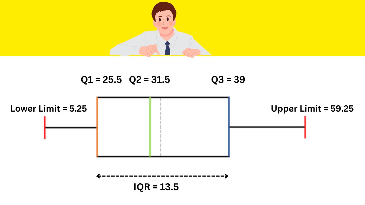
Step2: Calculate quartiles and median:
n = Total number of data points = 20
Q1 (25th percentile) = 25% of (n+1)term = 0.25 × (20 + 1) = 5.25th term in the data set
It should be between 5th and 6th data values: Q1 = (5th data value + 6th data value)/2 = (25+26)/2 = 25.5
Q1 = 25.5
Q2 (50th percentile, median) = 50% of (n+1)term = 0.50 × (20 + 1) = 10.5th term in the data set
It should be between 10th and 11th data values: Q2 = (10th data value + 11th data value)/2 = (31+32)/2 = 31.5
Q2 = 31.5
Q3 (75th percentile) = 75% of (n+1)term = 0.75 × (20 + 1) = 15.75th term in the data set
It should be between 15th and 16th data values: Q3 = (15th data value + 16th data value)/2 = (38+40)/2 = 39
Q3 = 39
Step3: Calculate the Internal Quartile Range (IQR):
IQR = Q3 – Q1 = 39 – 25.5 = 13.5
IQR = 13.5
Step4: Calculate Upper and Lower Limits to identify outliers:
Lower limit = Q1 – 1.5 × IQR = 25.5 – (1.5 × 13.5) = 5.25
Lower limit = 5.25
Upper limit = Q3 + 1.5 × IQR = 39 + (1.5 × 13.5) = 59.25
Upper limit = 59.25
Any data value below the lower limit and above the upper limit is considered an outlier.
Step5: Draw the Box plot:
- Draw horizontal lines representing the number line for wait times.
- Draw a box from Q1 to Q3 (25.5 to 39)
- Draw a vertical line at the median (31.5)
- Extend whiskers from the box to the minimum (20) and maximum (50) non-outlier data points.
- Plot any outliers if present beyond the whiskers.
Step6: Interpet the Box plot:
You can see that I draw a Box plot using manual calculations and you can draw it using Minitab software as well. The median wait time of 31.5 is represented by the center line inside the box.
The length of the box (13.5) represents the IQR, which indicates the spread of the data. Any data value below 5.25 or above 59.25 min would be considered an outlier. But in the wait time data example, there are no outliers.
All wait time data values are between 18 to 50 which lies in the lower and upper limit of a box plot. For normally distributed data, the median is at the center of the box plot and the whiskers are almost the same on both ends.
If the median lies a little bit closer to the first quartile and whiskers at the lower end are shorter then you can call it a positively skewed distribution.
On the other hand, If the median lies closer to the third quartile and if the whisker at the upper end is shorter then you can call it a negatively skewed distribution. That’s how you can interpret the box plot and make data-driven decisions.
Advantages and Limitations
Advantages –
- It provides a clear visual representation of the distribution of data, including the central tendency, variability, and skewness.
- They highlight the outliers in data and make it easier to detect unusual data points that may require further investigation.
- Box plots convey a lot of statistical information in a compact format, making them space-efficient for presenting multiple datasets simultaneously.
- Box plots allow for easy comparison of data distributions across different groups or categories to identify patterns or differences between them.
- They are robust to outliers and skewed data and provide a reliable summary of the dataset’s characteristics even in the presence of extreme values.
Limitations –
- Understanding and interpreting box plots may require some levels of statistical knowledge which can pose challenges for individuals without a strong background in data analysis.
- They may not accurately represent the underlying distributions of small sample sizes, leading to misinterpretation of data characteristics. (Check out – How to utilize a Scatter Plot for data analysis?)
- While box plots provide a broad overview of the data distribution, they may lack the detail needed for a deeper understanding of the data such as specific data points.
Applications of box plot in data analysis
- Box plots provide a clear visual representation of the central tendency typically median and spread of the data. By observing the length of the box and the position of the median, you can quickly understand where the bulk of the data lies and how spread out it is.
- Outliers that significantly deviate from the rest of the data, can be easily identified using the box plot. These outliers indicate errors, defects, or special causes of variation in the process that need attention.
- Box plots are excellent at comparing distributions of different datasets. By placing multiple plots side by side, you can visually compare the central tendencies, spreads, and shapes of the distributions.
- This tool also plays a crucial role in assessing process stability and variability. A stable process exhibits consistent behavior over time, reflected in a box plot with a narrow and symmetric box.
- A process with high variability will have a wider and more skewed box. By monitoring changes in the box plot parameters over time, you can evaluate process stability and identify opportunities for improvement.
- Box plots can also be used to assess the effectiveness of process improvements. Comparing box plots before and after the improvements allows you to see if there are any noticeable shifts in central tendency, dispersion, or outlier frequency.
- While investigating process issues, this tool can help you identify potential root causes. By comparing box plots of different conditions or factors, you can pinpoint differences in data distributions that may be contributing to the problem.
- In manufacturing and service industries, this tool is used for quality control purposes. By monitoring the variability in product or service quality over time, you can take corrective actions to maintain consistent quality standards and customer satisfaction.
If you want to learn data analysis tools for problem-solving and get certified in Lean Six Sigma then I would like to recommend the best practical live training program check out – Lean Six Sigma with Minitab live training program and certification.
Conclusion
I believe that the box plot is one of the best data analysis tools in the arsenal of any data analyst or process improvement professional. It offers profound insights into the distribution, variability, and outliers within a dataset.
By mastering the interpretation and utilization of a box plot, you gain the ability to uncover hidden patterns, identify potential sources of variation, and pinpoint areas for improvement within your processes.
Whether you are striving for operational excellence, quality enhancement, or cost reduction, the box plot empowers you to make informed decisions based on data-driven evidence.
You can use it to diagnose problems, monitor performance, and track the effectiveness of your improvement efforts over time.
If you found this article useful then please share it in your network and subscribe to get more such articles every week.


