
Have you ever found yourself struggling to identify patterns or relationships between data? If yes then you need a scatter diagram, a simple but effective data visualization tool that illustrates the correction between variables.
Whether you are examining cause-and-effect relationships, identifying patterns, or uncovering outliers, the scatter diagram guides you through the maze of data complexity. It systematically helps you extract meaningful insights from the data.
In this article, I will discuss the effective data visualization tool scatter diagram in detail including its components, types of relationships between data it shows, benefits and limitations of this tool along with common pitfalls to avoid.
The Most Important I will discuss is how to create this diagram and interpret it during problem-solving. So are you ready to master one more data visualization tool from the toolkit? Then let’s get started…
Role of Data Analysis in Lean Six Sigma
Before understanding the Scatter diagram, it is important to know the role of data analysis in Lean Six Sigma. Let’s say you are driving a car with a blindfold on your eyes.
See you might move forward but you are likely to encounter obstacles, take wrong turns, and ultimately not reach your destination efficiently.
In the same context, Data analysis in Lean Six Sigma is like taking off that blindfold and acting as GPS, it provides clarity, and direction and helps you make informed decisions to reach your process improvement goal effectively.
Data analysis helps identify areas within a process where improvements can be made. By analyzing historical data, trends, and patterns, you can pinpoint inefficiencies, bottlenecks, and sources of defects that impact quality, cost, or delivery.
Data analysis allows you to understand the different types of variation within a process, whether it’s common cause variation or special cause variation. By differentiating between the two you can determine whether process adjustments are needed or not.
When a problem arises in the process, data analysis tools like Pareto analysis, Fishbone diagram, Scatter diagram, and Regression analysis help you dig deep to understand the underlying factors contributing to issues.
By addressing root causes rather than symptoms, you can implement sustainable solutions that prevent problems from recurring. One of the important things data analysis provides is quantitative insights into process performance.
KPIs like cycle time, defect rate, and process capability are analyzed to assess the current state and track progress over time. This data-driven approach helps organization sets targets, monitor improvement efforts, and ensure alignment with strategic objectives.
Before implementing process improvement changes, you need to validate their effectiveness. For that, data analysis allows you to compare performance before and after interventions and ensure that improvements are indeed delivering the desired outcomes.
Hope now you understand the importance of data analysis in Lean Six Sigma. See, there are many data analysis tools you need during process improvement projects like Histogram, Bar graph, Box-plot, RCA, etc.
But for this article, my focus is on the Scatter diagram, now let’s discuss this data analysis tool in detail along with its applications during process improvement projects.
What is a Scatter Diagram?
The Scatter diagram also known as a scatter plot or scatter graph, is one of the most powerful data visualization/analysis tools used specifically for analyzing the relationship between two variables.
It allows you to observe how changes in one variable affect another, and with that, you can identify patterns, trends, and correlations within the data.
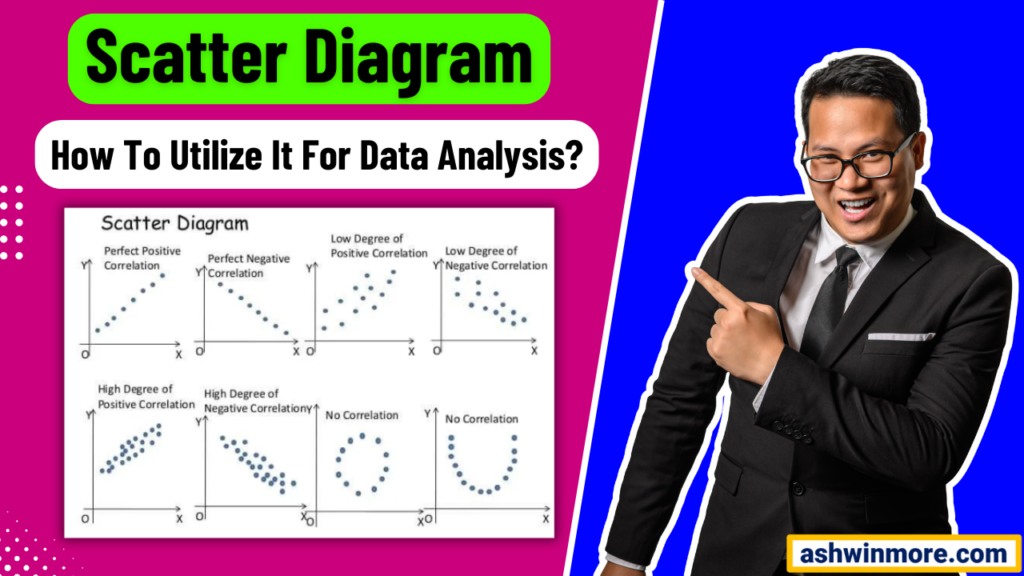
It is effectively used for identifying the cause-and-effect relationships between factors that influence the overall process or process outputs. Let’s see the 4 important components of this tool:
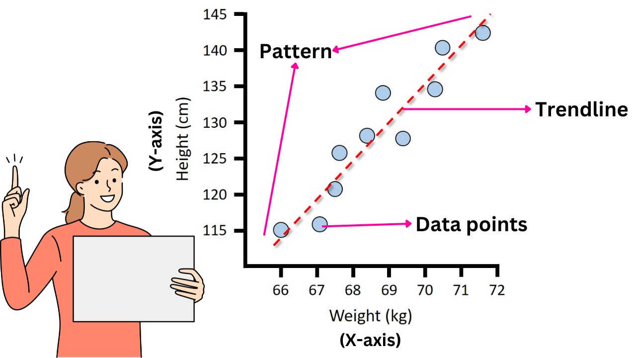
- X-axis and Y-axis: The X-axis represents one variable (the independent variable), while the Y-axis represents the other variable (the dependent variable). These axes provide a framework for plotting data points and visualizing their relationships.
- Data points: Each data point on the scatter diagram represents the specific combination of values for the two variables being analyzed. These points are plotted at the intersection of their respective values on the X and Y axis.
- Patterns: Patterns with the diagram reveal the nature of the relationship between two variables. These patterns include clusters of points, trends, or the absence of any patterns.
- Trend line: A trend line is added to the diagram to visually represent the overall direction or trend of the data points. This line helps you understand the patterns of data points plotting on the diagram.
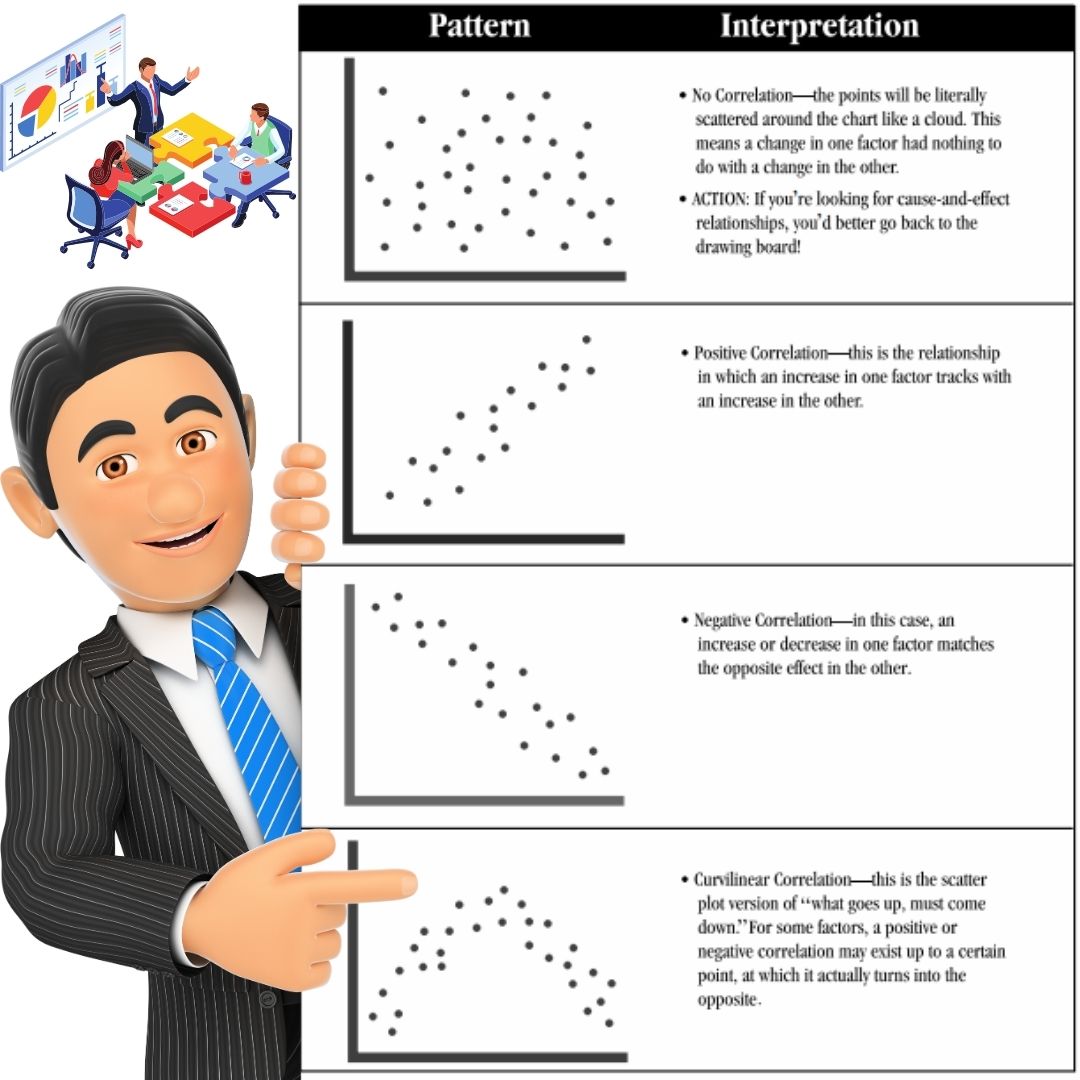
In the above image, you can see all the patterns of the scatter diagram and what that pattern means. 1st pattern shows no correlation between two variables which means changes in one factor or variable do not have a consistent impact on the other variable.
2nd pattern shows a positive correlation between two variables which means the value of one variable increases, then the value of the other variable also tends to increase. It is showing an upward trend (Direct proportion).
3rd pattern shows a negative correlation between two variables which means the value of one variable increases then the value of the other variable tends to decrease. It shows a downward trend (Indirect proportion).
4th pattern shows a curvilinear correlation which means what goes up, must come down after some time. Two variables initially show positive correction but sometimes with more data values, they show negative correction and vice versa also happens.
Let me break down this data analysis tool with a simple example:
Let’s say you are a manager at a manufacturing plant aiming to improve production efficiency. You decide to analyze the relationship between the number of workers on the production line (X-axis) and the number of units produced per hour (Y-axis).
You collect data over several days, recording the number of workers present and the corresponding units produced per hour. After compiling data you create a scatter diagram to visualize the relationship.
Upon plotting the data points, you noticed a trend: As the number of workers increases, there is an increase in the number of units produced per hour. It’s a directly proportional relationship or you can say a positive correction between two variables.
(Check 2nd pattern from the above image) From this insight, you can make informed decisions to optimize production efficiency. Things you can do like: You may adjust the staffing levels during peak hours to maximize output while minimizing labor costs.
Also, you may investigate other factors contributing to fluctuations in production and address them accordingly. With this example, I am sure you understand how effective this data analysis tool is.
My point here is a scatter diagram not only gives you a visual representation of the relationship between two variables but also gives you direction to make informed decisions and guides you to take value-added actions for improvements.
Practical Steps To Create And Interpret Scatter Diagram
Let me share with you the general practical steps that you can follow while creating a scatter diagram. You can use these steps to determine the relationship between any type of variables. Let’s see the steps one by one:
Step1: Data collection and preparation
Before diving into creating a diagram initially, you need to gather the relevant data and ensure its accuracy. Here you need to identify the variables that you want to analyze and collect data points for each variable.
Make sure your data is reliable, complete, and representative of the process or phenomenon you are studying. Clean the data by removing outliers or errors that could skew your analysis.
You can organize data in a format that is easy to work with such as a spreadsheet and ensure consistency in units and measurements. You can do this manually or use software like Excel or Minitab.
Step2: Choosing appropriate variables
Selecting the right variables is crucial for creating a meaningful scatter diagram. Identify the two variables you want to explore for any potential relationship or correlation. These variables should be measurable and relevant to your analysis.
For example, if you are studying the relationship between employee training hours and productivity, your variable might be training hours and productivity. Choose variables that you suspect might be related or ones that you want to investigate further.
Step3: Plotting data points
With your chosen variables in hand, it’s time to plot your data points on a graph. Label one variable on the X-axis (Horizontal), and the other on the Y-axis (Vertical). Each data point represents the values of both variables for a single observation or data set.
Plot the data points accurately, and ensure they are spaced evenly and proportionally. Use clear and concise labels for both axes to make your scatter diagram easy to interpret.
Step 4: Analyzing patterns and relationships
Once your data points are plotted, examine the pattern or trend they form on the scatter plot. Look for any observable relationship between the two variables. Patterns may include a positive correlation (as one variable increases, the other also increases).
If the data points form a diagonal line sloping upwards from left to right, it suggests a positive correction. On the other hand. if the line slopes downwards, it indicates a negative correlation, (which means as one variable increases, the other decreases).
The pattern also shows no correlation (it is a random distribution of data points). Use visual inspection to identify any clusters, trends, or outliers that could indicate a relationship between the variables.
If most of the data points are clustered around a straight line, it suggests a strong correction between the variables. If they are scattered randomly, it indicates little to no correlation.
Step 5: Drawing conclusions and insights
Based on your analysis of the scatter plot, draw a conclusion about the relationship between the variables. Consider the strength and direction of correction as well as any factors that may influence the relationship.
To quantify the strength of the relationship between the variables, you can calculate the correlation coefficient. The correlation coefficient ranges from -1 to +1, where +1 means strong positive correlation, -1 means strong negative correlation and 0 indicates no correlation.
Use your findings to generate insights and make informed decisions. For example, if you observe a strong positive correlation between employee training hours and productivity, you may conclude that investing more in employee training could lead to increased productivity.
Conversely, if there is no discernible relationship, you may need to explore other factors affecting the outcome. That’s how you can create a scatter diagram and interpret it at the end.
Benefits of Scatter Diagram
- One of the goals of using scatter diagrams is to facilitate data-driven decision-making. By providing a clear, intuitive visualization of the relationship between variables, it empowers decision-makers to make informed choices based on empirical evidence.
- It helps you identify outliers or anomalies within the data set. These outliers may represent errors in the data collection, unusual events, or genuine exceptions to the norm.
- By visually pinpointing outliers, you can investigate the causes behind these deviations and determine whether they require further correction.
- It reveals patterns and trends in the data. This insight is important for understanding how changes in one variable impact another and for predicting future behavior based on historical data.
- A scatter diagram visual representation between two variables helps you understand the nature and strength of the relation between two variables such as Strong positive or Weak positive correlation, Strong negative or Weak negative correlation.
- Beyond visualizing the relationship between variables, a scatter diagram allows you to quantify the strength and direction of the correction between two variables.
- By calculating the correlation coefficient using this diagram you can measure the degree of association between two variables.
Limitations of Scatter Diagram
- The effectiveness of a scatter diagram depends on the quality of the data. Inaccurate or incomplete data can lead to misleading conclusions and undermine the reliability of the analysis.
- A scatter diagram provides a visual representation of data but it may not facilitate detailed quantitative analysis. For that, advanced analysis tools like Regression analysis are needed to quantify the strength of the relationship between variables.
- Scatter diagrams assume a linear relationship between variables, but in reality, the relationship can be non-linear. In such cases, the diagram may not accurately represent the true nature of the relationship.
- A scatter diagram can only display the relationship between two variables at a time, but it does not indicate causation. Just because two variables are correlated does not mean that one causes the other.
- A scatter diagram can only display the relationship between 2 variables at a time. This limitation restricts their ability to capture more complex relationships involving multiple factors.
Real-world Applications of this tool
In quality improvement initiatives, identifying the root causes of defects is important. This diagram helps visualize the relationship between process variables and quality metrics.
By plotting data points representing these variables, the quality team can discern patterns and correlations. For example, in the Manufacturing setting, this diagram can help you reveal if there is a relationship between machine setting and product defects.
This insight enables targeted interventions to address root causes leading to improved quality and reduced defects. In process optimization, understanding how process variables impact performance metrics is crucial.
This diagram facilitates the analysis by visually depicting correlations between inputs and outputs. For example, in a call center environment plotting call duration against customer satisfaction scores can reveal if longer calls correlate with lower satisfaction.
With this knowledge, organizations can optimize processes by adjusting variables to achieve desired outcomes. In product development, meeting customer preferences is essential.
Here the scatter diagram aids in understanding these preferences by mapping product attributes against customer satisfaction or market demand.
For example, in the automotive industry plotting car prices against customer satisfaction levels can unveil if there is a correction between price and perceived value.
This information guides product development efforts, ensuring offerings align with customer needs and market trends. In risk management, identifying and mitigating risks is essential for any organization.
This diagram helps assess the relationship between risk factors and their impact on outcomes. For example, in financial risk management plotting interest rates against default rates can reveal if there is a correlation between two variables.
This understanding enables proactive risk mitigation strategies, minimizing adverse effects on organizational objectives. In predictive analysis, this diagram helps forecast future outcomes based on historical data.
For example, in retail, you can use a scatter diagram to analyze the relationship between promotional spending and sales revenue.
By identifying a strong positive correlation between the two, retailers can make informed decisions about future promotional strategies to maximize revenue.
If you want to learn data analysis tools for problem-solving and get certified in Lean Six Sigma then I would like to recommend the best practical live training program check out – Lean Six Sigma with Minitab live training program and certification.
Conclusion
By properly collecting and plotting data points on a scatter diagram, you can gain visual clarity on the interplay between variables. You can identify the relationship between variables that helps you make informed decisions and targeted process improvement.
Whether it’s identifying cause and effect relationships, optimizing production processes, or enhancing customer satisfaction, the insights derived from scatter diagram analysis empower you to implement data-driven solutions that drive measurable results.
I can confidently say that a scatter diagram is not just a data visualization tool, it is one of the most important parts of the continuous improvement toolkit that drives organizational excellence.
If you found this article useful then please share it in your network and subscribe to get more such articles every week.


