

Have you created a Pareto chart on an excel sheet? the easiest way to interpret the Pareto chart is to create it in excel or on Minitab because when you see the chart visually it becomes easy for you to understand the significant causes of the problem.
A Pareto chart is an amazing tool used in problem-solving and quality management work. The biggest advantage of this tool is it helps project teams to identify significant causes of the problem, so that project teams can work on those causes that have the highest impact on the problem.
In this article, I am going to discuss a step-by-step procedure to create a Pareto chart on an excel sheet as well as on Minitab. I will discuss this using one practical example so that you will also understand how to interpret the Pareto diagram. So let’s start…
What is a Pareto chart?
Before understanding how to create a Pareto chart on an excel sheet let’s have an overview of some fundamental concepts of a Pareto chart. Vilfredo Pareto the famous Italian professor of the economy used the Pareto chart for the first time in the 19th century.
In his research work, he observed that the top 20% of any country’s population accounts for more than 80% of the country’s total income. This concept later become popular by the name of the 80-20 principle and started using it during many economical decisions making works.
After that Dr.Joseph Juran, one of the popular quality gurus saw the application of this Pareto chart in quality improvement so he extended that tool to quality control, and then it became popular by the name of Vilfredo Pareto principle and 80-20 principle.
Dr. Juran found that 20% of the causes contributed to 80% of the quality problems and that’s how it became a popular decision-making tool in quality management and problem-solving, which helped the business to identify vital few causes of problems from trivial many.
Because of its problem-solving usability, this tool is also implied in the DMAIC process improvement cycle especially during the define phase to select significant project ideas and also during analyze phase to identify significant causes of problems.
This tool is based on the 80-20 principle which says that 80% of the problems in the process or systems are caused by 20% of the significant factors. So it separates vital few factors from trivial many factors. That is the fundamental concept behind Pareto chart analysis.

If you want to learn more about the Pareto chart and its structure then please check out this – How Pareto chart can help you identify significant causes of a problem?
Now let’s move on to understand how you can create a Pareto chart on an excel sheet as well as in Minitab step by step with one example. Before that let’s see some examples of Pareto analysis and its applications.
Examples of Pareto analysis –
- In business, 80% of the complaints come from 20% of the customers.
- 80% of the business sales and profit come from 20% of the customers.
- 20% of the employees are responsible for completing 80% of the office work.
- 20% of the total blog articles on the website generate 80% of the traffic.
- 20% of your daily tasks give you 80% of the results.
When to use the Pareto analysis
- A Pareto chart is used in the decision-making process where you need to select vital few factors from trivial many like Lean Six Sigma projects, Lean or agile projects, business problem solving, selecting project ideas, etc.
- In the Lean Six Sigma project, it is used during analyze phase to identify significant causes of the problem means which causes have the highest impact on the problem or final outcome. To do this project team prefer to create a Pareto chart on excel to see a visual picture.
- It is also used in the define phase of the Six Sigma project, where you need to select the right project opportunity from the multiple project opportunities or ideas.
How to create a Pareto chart on excel?
Here I am going to take an example of the injection molding process in which there are 7 types of defects we have. Their names are as follows Short shot, gate short, gate long, no fill, splay, scratch, color, etc.
In this example, I am going to find the significant causes of defects that have the highest impact on the process (80-20 principle). For this initially, I am going to create a Pareto chart on an excel sheet and then I will also create a Pareto chart in Minitab using the same example. Let’s start…
1. Insert data into the excel spreadsheet –
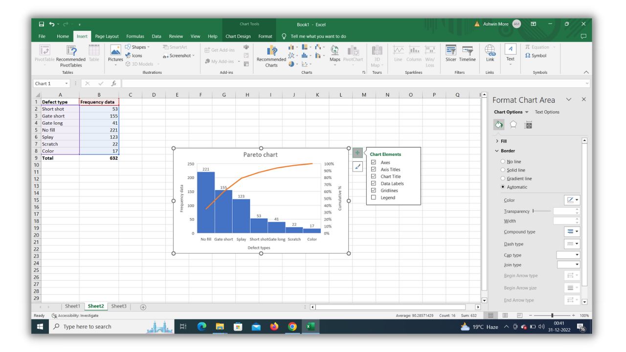
First, you should add the collected frequency data for each defect type in the spreadsheet. Create two columns one for defect type and another for frequency data and also calculate the total for frequency data using simple excel formula for addition. [Total=Sum (B2:B8)]

2. Insert tab > Recommended charts > Pareto chart
After the home tab, you can see the inset tab there just click on that, and then you will find recommended chart option there. First, select the defect type and frequency data column and then click on the recommended chart tab.
Once you click on that a new window opens where you can see 5 different types of charts out of which the last type i.e. 5th one is the Pareto chart. Select that and just click ‘ok’, once you click ok you will see a final Pareto chart on an excel sheet.

3. Add all the required elements on the Pareto chart
You can see the final Pareto chart ready. On the X-axis, we have Defect types. On the left Y axis, we have frequency data and on the right Y axis, we have cumulative% data. Then in the middle defect types bars are arranged in descending order of frequency of occurrence.
On the top right side of the Pareto chart on an excel sheet, there is one option i.e. ‘chart element’ you can use that to add elements like axis titles, chart titles, data labels, gridlines, etc. Adding these elements helps you interpret and present the chart easily.

4. Interpret the final Pareto chart on an excel sheet
You can see the orange cumulative percentage line which shows that defect type No fill, Gate short, and Splay have the highest impact on the injection molding process. (No fill + Gate short + Splay ) / total = (221 + 155 + 123)/ 632 = 499/632 = 0.7895 = 79% approximately 80% combined impact on the final outcome.
That 80% cut-off line shows the 80-20 principle i.e. 80% of problems happen in the injection molding process due to defects like no fill, gate short, and splay i.e. 3 out of 7 defect types. Hence we need to work on these 3 defect types first to improve the process.

How to create a Pareto chart on Minitab?
Let’s take the same example of injection molding process defects like a short shot, gate short, gate long, No fill, splay, scratch, color, etc. I have the frequency of occurrence data for each defect type.
Now we need to find out the significant defects that have the highest impact on the injection molding process. Let’s create a Pareto chart in Minitab with the help of simple steps. I think it is easy compared to creating a Pareto chart on an excel sheet.
1. Insert data into the Minitab spreadsheet
Here also first, you should add the data collected in the Minitab sheet. You can see that in the sheet the first column is for defect types and 2nd column is for frequency of occurrence data. Insert the data in the sheet accurately before analyzing that data.

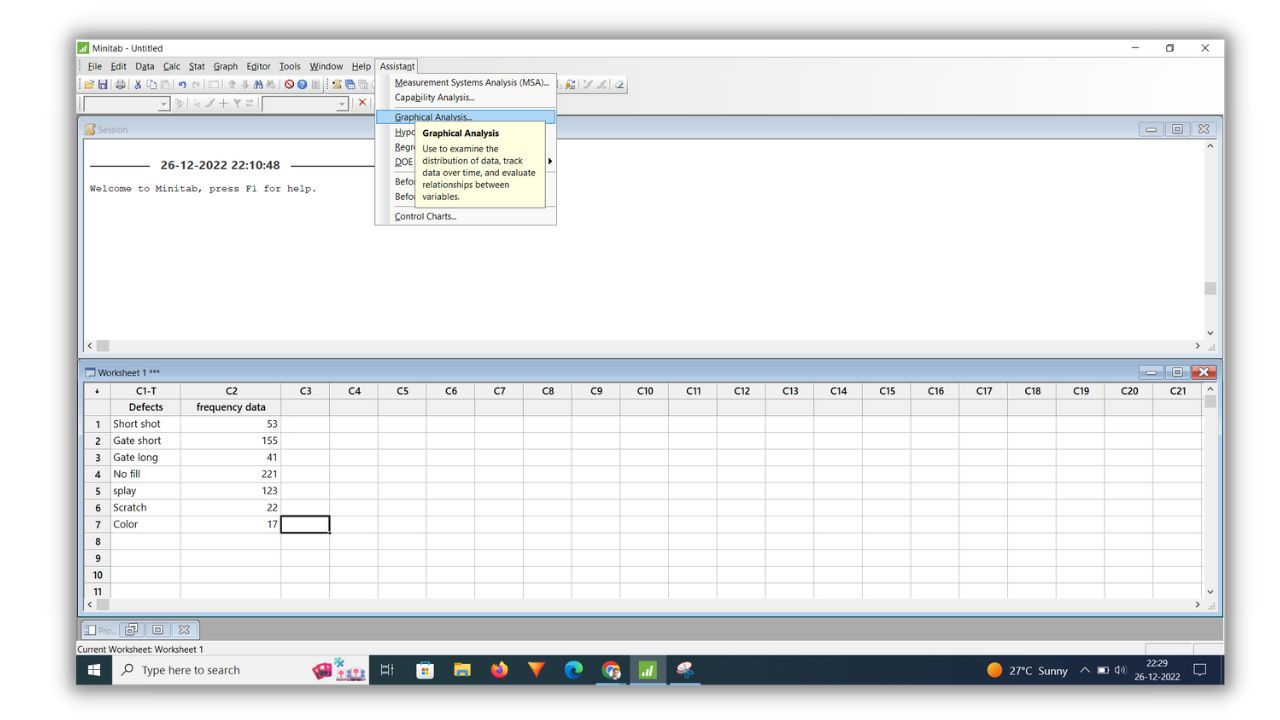
2. Check Assistant > Graphical analysis > Pareto chart
You can see on the top menu bar the last tab is Assistant, just click on that and a sub bar will open from that sub bar you have to select the graphical analysis (3rd from the top).
Once you click the graphical analysis the new window opens i.e. choose graphical analysis where you can see multiple options like histogram, control chart, interaction plot, box plot, scatter plot, Pareto chart, etc.
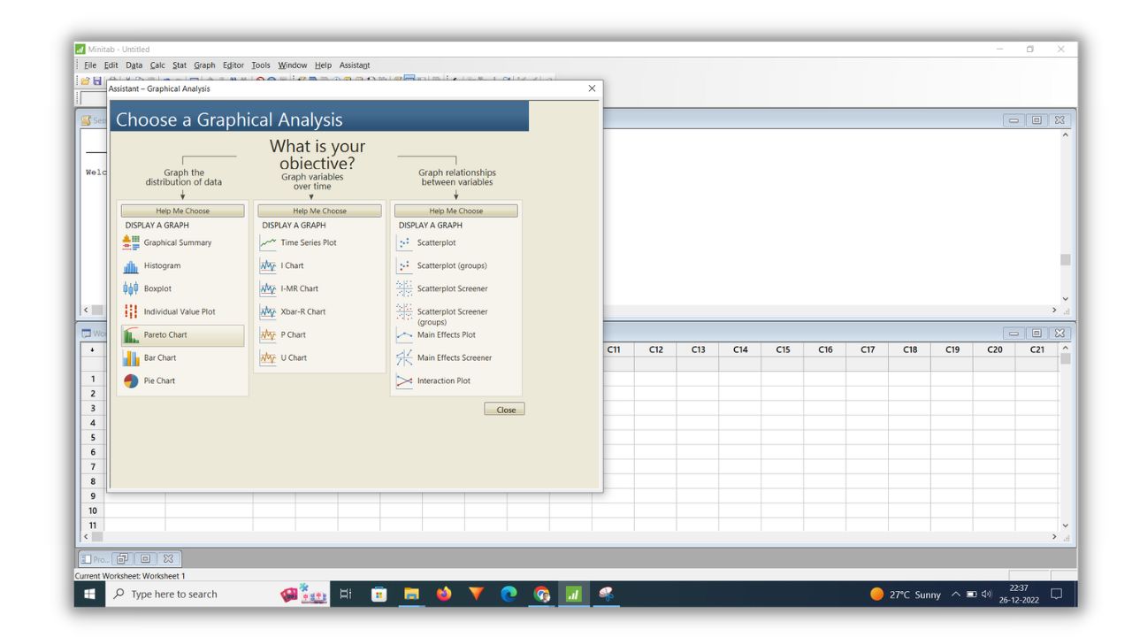
3. Click on the Pareto chart and add the required details
In the graphical analysis window, click on the Pareto chart, and after that new window will open with the heading Pareto chart. In that window, you have to add the details. You can see two blank options there ‘defect names column’ and the ‘summarized value column’.
Click on the defect names column and select the defect column there and after that click on the summarized value column and select frequency data. On the bottom side, there is one option called ‘show cumulative line’ just click that box because we want a cumulative line in the final part chart.
The cumulative line will help you during the interpretation of the Pareto chart. Once you select these three things on that window just click ‘Ok’.

4. Final Pareto chart is ready.
Once you click ok on the pareo chart window you will get the final Pareto chart ready in Minitab.

5. Interpret the final Pareto chart.
See the final Pareto chart above there is a thumb rule to interpret it correctly. “Identify the defects that have the greatest impact on your process. The tallest bars represent the defects that occur most frequently or that incur the largest costs. Focus your improvement efforts on these defects to achieve the greatest gains.“
If you see the chart above you can see a cumulative percentage of 79% for the splay defect type which means the defect type No fill, Gate short, Splay occurs the most and has the highest impact on the injection molding process output.
These three defects are vital defect types on which you need to take action to improve the entire process. Start fixing the defect with the tallest bar i.e. No fill then fix the gate short and then go for splay.
Conclusion
Creating a Pareto chart on an excel sheet or in Minitab is so useful when you are working on problem-solving projects like Lean Six Sigma projects. Because this will help help you analyze the data easily with the visual presentation.
You can create a Pareto chart manually by doing some calculations but that is a time-consuming process however creating a Pareto chart on an excel sheet and in Minitab is super easy because here software will do calculations for you and you just need to follow the step-by-step procedure.
In this article, I discussed step by step how to create a Pareto chart on an excel sheet as well as in Minitab with the help of one practical example. I hope you understood the procedure very well. Feel free to ask your doubts in the comment section.
If you found this article useful then please share it in your network and subscribe to get more such articles every week. (Get certified in Lean Six Sigma – IASSC/ASQ Lean Six Sigma training program)


Cheers!