

Have you ever been confused between multiple causes of problems and failed to understand which cause is most significant? Well, this is the common issue project team face while working on problem-solving or improvement projects. That is where the application of Pareto chart comes into the picture.
The Pareto chart is one of the best quality management and problem-solving tool used across the organization. This effective decision-making tool visually displays the most significant causes of the problem.
It helps the project team to separate the vital few significant factors which have the highest impact on the output from trivial many. In this article, I am going to discuss the Pareto chart in detail like the fundamental concept behind this tool, and how to create this chart step by step.
Advantages and disadvantages of this tool, one practical example, interpretation of the complete chart, and its different applications, etc. In the end, you will understand how to use this tool at your workplace to identify significant causes of problems. So Let’s start…
History of Pareto chart
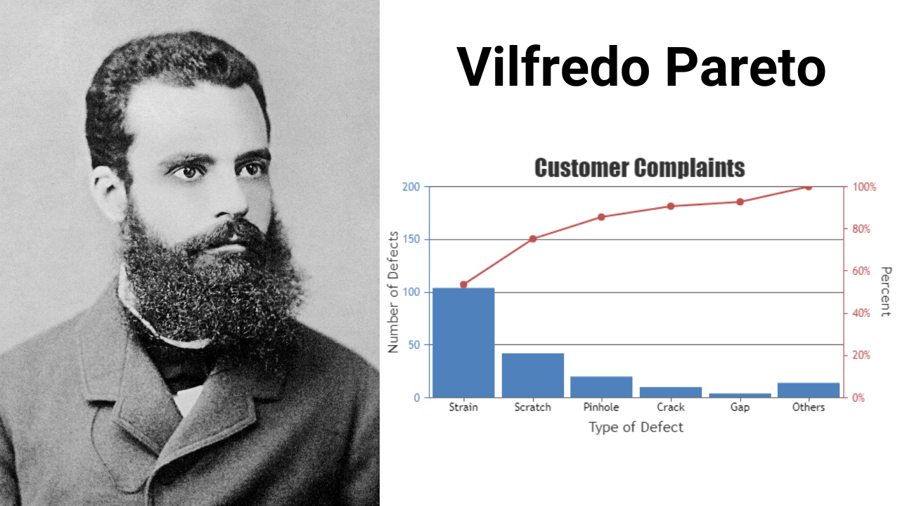
The Pareto chart was originally used by Vilfredo Pareto who was one of the famous Italian professors of the economy in the 19th century. In his research work, he observed that the top 20% of any country’s population accounts for more than 80% of the country’s total income.
This concept later became popular in economic decision-making by the name of the 80/20 principle. After that, Dr. Joseph Juran (quality guru) saw the application of this tool in quality improvement so he extended this principle to quality control.
He found that 20% of the causes contributed to 80% of the quality problems, in business 80% of the complaints come from the 20% of the customers, 80% of the business sales come from the 20% of customers, etc.
That’s how it became a popular decision-making tool in quality management and problem-solving, which helped businesses to identify the vital few factors from trivial many. Because of its effectiveness, this tool is also implied in the DMAIC process improvement cycle.
What is Pareto chart and why is it used?
Pareto chart is one of the 7 quality control tools used in problem-solving which is based on the 80-20 principle. As per this rule, 80% of the problems in the process or systems are caused by 20% of significant factors.
In simple terms, this rule states separate vital few factors from trivial many. Because those vital few factors have the highest impact on the output and the Pareto chart will help you separate those vital few factors from trivial many.
The Pareto chart analysis consists of obtaining data on the frequency at which the different causes have been occurring in recent history. You want to rank then the causes based on their frequency with the cause having the highest frequency being ranked first.
Then create a Pareto diagram, it is basically a bar chart made with a percentage frequency on the y-axis and the causes on the x-axis arranged in ascending order of rank or in other words descending order of frequency and the bars represent the frequency of occurrence of a particular cause.
You can see the image below the X-axis or the horizontal axis on the chart displays nominal data or you can call it non-numeric data and mode is central tendency measurement for this data because you can’t take its average or median.

This nominal data on the X-axis shows the different categories (causes of the problem or defect types). Then on the left side Y-axis, there is the frequency of occurrence data ( Count – How many times a particular cause/defect occurs).
On the right side Y-axis, there is cumulative percentage data (for each cause/defect type). Then there is a cumulative % line, you can see that curve line drawn from the first bar. This line shows whether it is worth solving the cause of the problem or defects.
If the cumulative % line is steep, then the type of defects or causes have a significant cumulative effect. That means it is worth finding the causes of these types of defects and fixing them as soon as possible.
On the other hand, if the cumulative % line starts to flatten, the types of defects or causes do not deserve as much attention so solving them will not have any big impact on the output.
After that, you can see the bars are arranged in descending order of frequency of occurrence from left to right (highest impact to lowest on the output) i.e. tool defects, part defects, poor material, and so on.
The last element of the Pareto diagram is the 80% cut-off line. This line separates the vital few factors/causes/defects from the trivial many.
You can see that in the image, as per the 80% cut-off line tool defect, part defect, and poor material have a high cumulative effect.
These three are the vital few or significant causes/defects that are contributing to 80% of the problem and hence these need to be addressed in order to make a major improvement.
The remaining causes or defects are contributing to 20% of the problem so reducing/eliminating them will not have a huge impact on the problem.
Alright, so this is the entire structure of the Pareto chart which will help you identify vital few from trivial many. If you still have any confusion then don’t worry, later in this article, You will learn how to create this chart step by step. Before that let’s see some examples.
Relevant content – What are the 7 Quality control tools?
Get certified in Lean Six Sigma – ASQ/IASSC Lean Six Sigma combo training program and certification
Examples of Pareto chart analysis –
- 80% of profit comes from the 20% of customers.
- 20% of your activities will give you 80% of the results.
- 20% of blog articles generate 80% of website traffic.
- 20% of employees are responsible for completing 80% of office work.
- 80% of complaints regarding your product/service come from 20% of your customers.
- 80% of online business leads come from 20% of lead magnets.
- 80% of the quality-related problems in the process originate from 20% of the tasks.
- 80% of the health problems in life come from 20% of habits.
- 20% of the population controls 80% of the wealth.
When to use the Pareto chart
- Pareto analysis is used in a situation to help prioritize the vital few from trivial many opportunities. It is used when you have to choose from several opportunities. Eg- one project may have to be chosen from several other project opportunities, one cause of the problem addressed first from several other causes, etc.
- It is used during the analyze phase of the Six Sigma DMAIC project to highlight significant causes of the problem where you need to focus your initial improvement effort to achieve the best results.
- It is also used in the define phase of the Six Sigma project at the time of selecting the right project opportunity from multiple project opportunities.
- Pareto chart is widely used where effective decision-making involves and you need to select a vital few factors from trivial many like process improvement projects, quality management, business problem solving, and continuous improvement initiatives, etc.
How to creat pareto diagram?
Let’s understand how to create a Pareto diagram step by step with the help of one example. Suppose we have an injection molding process that has defects like a short shot, gate short, gate long, no fill, splay, scratch, color, etc.
During the time period, we captured how many defects resulted during that time (for each defect type we captured the frequency of occurrences).
Whatever data we collected using a check sheet that data we are going to use to create a Pareto chart to identify major significant defect types. Let’s start…
1. Develop a list of problems or causes that we are going to compare in the Pareto diagram.
In this example of the injection molding process, the defect types are short shot, gate short, gate long, no fill, splay, scratch, color, etc. You need to compare these defect types on the basis of their occurrence and then, in the end, find out the vital few defect types from trivial many.
2. Decide some appropriate measurements for defect types and capture the data.
Some of the common measurements for defect types are frequency ( how many times the defect occurs), time (how much time it takes), cost (how many resources the defect type used), etc.
In this example, we captured how many defects resulted during that time i.e. frequency data for each defect type.
| Defect types | Number of occurrences (Frequency data) |
| Short shot | 53 |
| Gate short | 155 |
| Gate long | 41 |
| No fill | 221 |
| Splay | 123 |
| Scratch | 22 |
| Color | 17 |
3. Calculate the grand total by adding the frequency data for each defect type.
You can see the data for each defect type. We have added all the data values for the respective defect type and got grand total of 632 and also arranged the defect type data in descending order (the most frequent to the least frequent).
| Defect types | Number of occurrences (Frequency data) | Arranged in a descending order | Data arranged in a descending order |
| Short shot | 53 | No fill | 221 |
| Gate short | 155 | Gate short | 155 |
| Gate long | 41 | Splay | 123 |
| No fill | 221 | Short shot | 53 |
| Splay | 123 | Gate long | 41 |
| Scratch | 22 | Scratch | 22 |
| Color | 17 | Color | 17 |
| Grand total | 632 | Grand total | 632 |
4. Find the percent of each defect type in the grand total by taking frequency data of the defect type, dividing it by the grand total, and multiplying by 100.
Find the percentage for each defect type. Use the formula: Percentage = (Frequency data/Grand total)* 100%
- No fill % = (221/632) * 100 = 35%
- Gate short % = (155/632) * 100 = 24.5%
- Splay % = (123/632) * 100 = 19.5%
- Short shot % = (53/632) * 100 = 8.4%
- Gate long % = (41/632) * 100 = 6.5%
- Scratch % = (22/632) * 100 = 3.5%
- Color % = (17/632) * 100 = 2.7%
| Arranged in descending order | Data Arranged in descending order (Frequency data) | Percentage |
| No fill | 221 | 35% |
| Gate short | 155 | 24.5% |
| Splay | 123 | 19.5% |
| Short shot | 53 | 8.4% |
| Gate long | 41 | 6.5% |
| Scratch | 22 | 3.5% |
| Color | 17 | 2.7% |
| Grand total | 632 | 100% |
5. Find the cumulative percentage for each defect type.
The cumulative percentage for each defect type is the sum of that defect’s percent of the total and that of all the other defect types that come before it in the ordering by rank. Let’s calculate for each defect type – (CP% i.e. Cumulative percentage)
- No fill (CP%) = (221 / 632)% 100 = 34.96% = 35%
- Gate short (CP%) = (221 + 155 / 632)% 100 = 59.5%
- Splay (CP%) = (221 + 155 + 123 / 632)% 100 = 78.95% = 79%
- Short shot (CP%) = (221 + 155 + 123 +53 / 632)% 100 = 87.3%
- Gate long (CP%) = (221 + 155 + 123 +53 + 41/ 632)% 100 = 93.8%
- Scratch (CP%) = (221 + 155 + 123 +53 + 41 + 22/ 632)% 100 = 97.3%
- Color (CP%) = (221 + 155 + 123 +53 + 41 + 22 + 17/ 632)% 100 = 100%
| Arranged in descending order | Data Arranged in descending order | Percentage | Cumulative percentage |
| No fill | 221 | 35% | 35% |
| Gate short | 155 | 24.5% | 59.5% |
| Splay | 123 | 19.5% | 79% |
| Short shot | 53 | 8.4% | 87.3% |
| Gate long | 41 | 6.5% | 93.8% |
| Scratch | 22 | 3.5% | 97.3% |
| Color | 17 | 2.7% | 100% |
| Grand total | 632 | 100% |
6. Draw the X and Y axis of the Pareto chart using the available data.
List the defect types on the horizontal X-axis (in descending order from highest to lowest). Label the left vertical Y axis with the number of occurrences of the defect (frequency data) and then label the right vertical Y axis with the cumulative percentage.
After that draw bars for each defect type as per frequency data. You can do this using pen and pencil or software like Minitab and Excel. Below you can see the Pareto chart I created using Minitab.
You can see the cumulative percentage line as well as the 80% cut-off line that separates vital few defect types from trivial many. Now let’s analyze the chart in the next step.
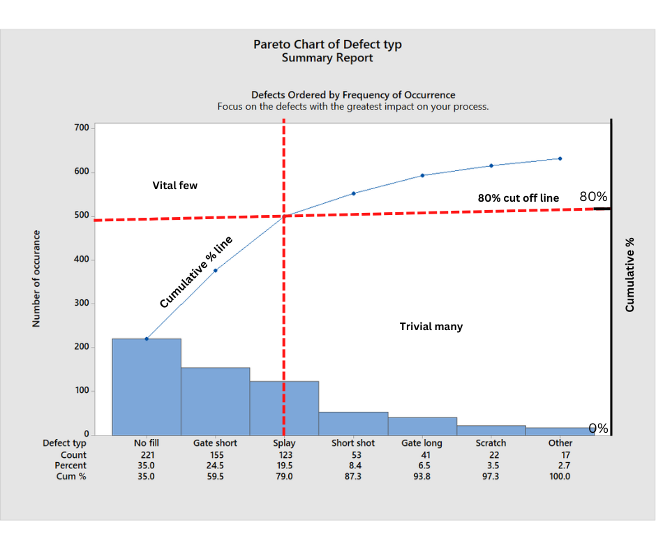
7. Analyze the final Pareto chart
Thumb rule – “Identify the defects that have the greatest impact on your process. The tallest bars represent the
defects that occur most frequently or that incur the largest costs. Focus your improvement efforts
on these defects to achieve the greatest gains.”
The cumulative percentage for splay is 79% which means the defect type No fill, Gate short, Splay occurs the most (Vital few defect type) and has the highest impact on the injection molding process output.
So you need to take action to overcome these significant defect types to improve the process. 1st fix No fill then gate short and at last Splay.
That’s how you can create a Pareto chart using these 7 simple steps and interpret the final results. You can use Excel or Minitab to make this chart creation process easy.
Advantages & disadvantages of Pareto chart
Advantages –
- The most important benefit of the Pareto chart is it helps in identifying the root causes of problems or defects in the process.
- It visually provides the explanation regarding the defect or problem in the process that needed to be solved first. Then, the project team can create a further action plan to solve the problem or remove the defects on the basis of the information they get from this chart.
- It asses the cumulative impact of a problem or defect in the process. (Cumulative impact means the effect of something happening over a period of time.)
- It identifies the most significant root causes of the problem which have the highest impact on the output.
- It also supports the project teams in effective decision-making during problem-solving work, selecting the right project idea to work on, selecting the right causes of problems to take action on, etc. So this chart improves decision-making.
- It helps in the planning and analysis of problems, quality management, time management, performance management, and change management.
Relevant content – Top 5 team decision making tools
Relevant content – How Root Cause analysis is useful to solve complex problems?
Disadvantages –
- The biggest disadvantage is it helps the project teams during the root cause analysis of the problem but it only shows the qualitative data and does not represent the severity of the defect or any problem.
- That means you can’t fully rely on this tool to find the root causes, you need to use other tools like FMEA and 5 why analysis along with the Pareto chart.
- Pareto analysis heavily relies on past data to detect defects or problems in the process but past data might not be relevant for future scenarios all the time. Therefore problem solver needs to focus on the present as well as future data.
Conclusion
Identifying the significant causes of the problem is a challenging task. Project teams spend most of their time detecting the right causes of problems and then finding ways to solve the problem.
Project teams go through a lot of decision-making processes and the Pareto chart helps them at every stage of decision-making.
Pareto chart analysis is a valuable tool in quality management for making effective decisions and identifying significant causes of the problem.
In this article, I discussed this tool in detail including its application, advantages & disadvantages, how to create this chart step by step, and its interpretation, etc.
I hope that this article helps you understand how to use the Pareto chart at your workplace to identify significant causes of problems. If you find this article useful then please share it in your network and subscribe to get more such articles every week.


Pingback: How to make Pareto chart on Excel? Complete tutorial for 2023
Pingback: Scatter Diagram: How To Utilize It For Data Analysis?